Side Project | Interaction Design, Animation
Focus
Interaction Design, Animation
Tools
Sketch, Framer
Date
Winter 2017
My friends and I often have difficulty deciding where to eat whenever we go out to eat. Either we don't know where to eat, or it just so happens that each member of the group doesn't care about where they eat. Phrases like "you pick", or, "where do you want to go?" will get thrown around until someone finally picks a place that everyone is more or less okay with.
I wanted to design a solution that would address the long time that it can take to pick a place to eat while maintaining and even improving how satisfied each group member is with the final choice.
The first step I always take when designing for a new project is making some very quick, very rough sketches. I had a general idea laid out already with the two stages to the selection process, so I just had to think about how to guide users through it.
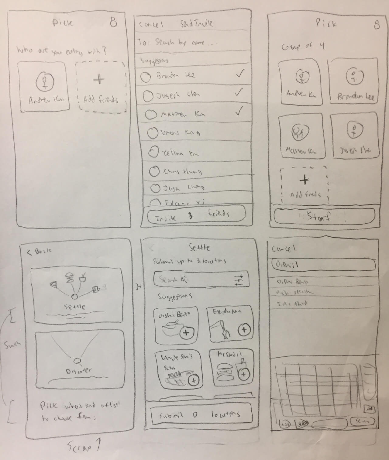
Creating a group and searching for locations
Search results and swiping cards for preferences

Results and search filters
Different ideas for saving locations and waiting screens
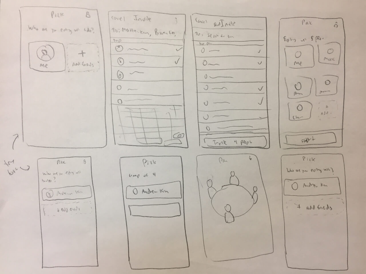
Exploring different options for home and group
Exploring different options for the suggestions and the final steps
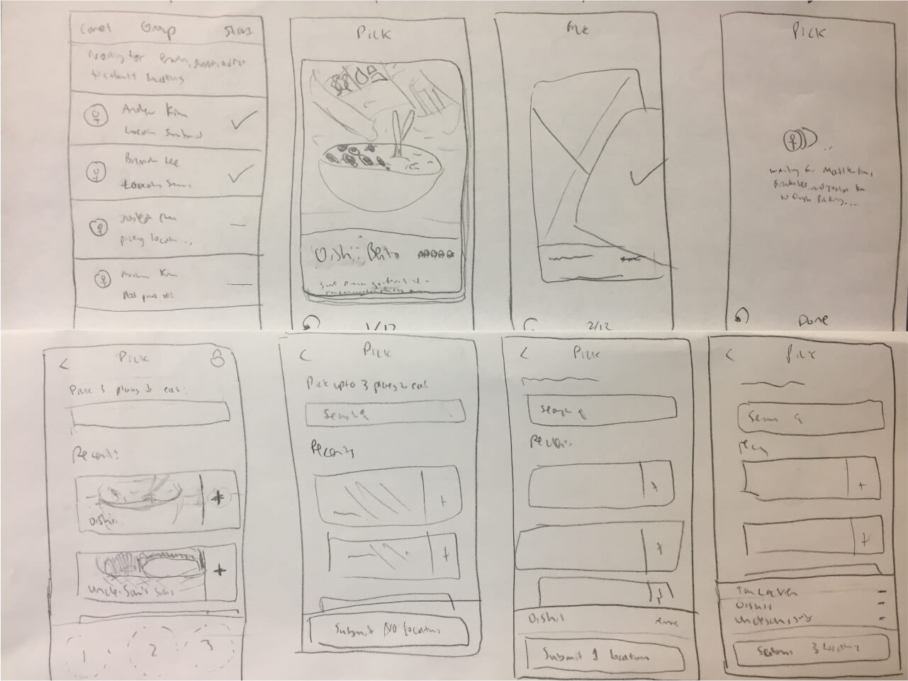
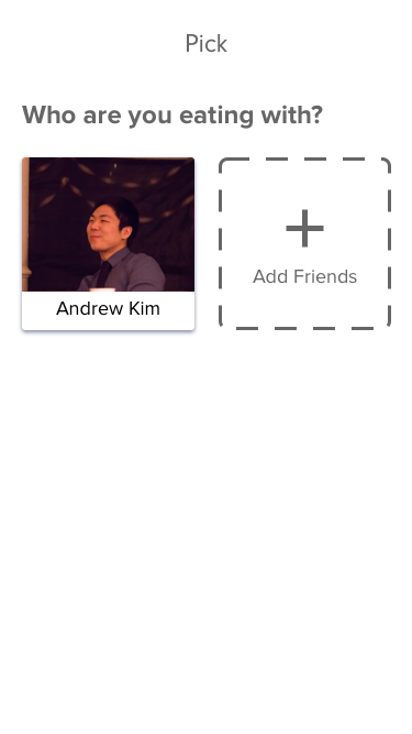
My next step was to create wireframes in Balsamiq. Sometimes wireframes may not feel necessary, but I've found that sketches can abstract away some important edge cases that wireframes can catch.
Landing Screen
Group Assembled
Browsing Locations to Suggest
Waiting for Suggestions
Swiping for Preferences
Results
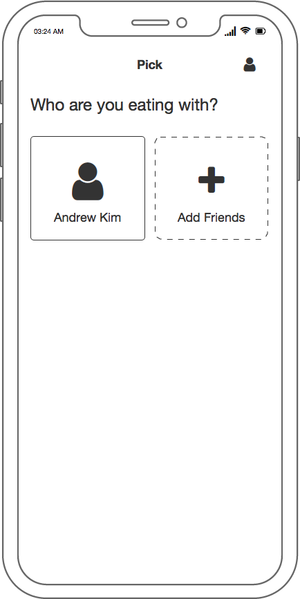
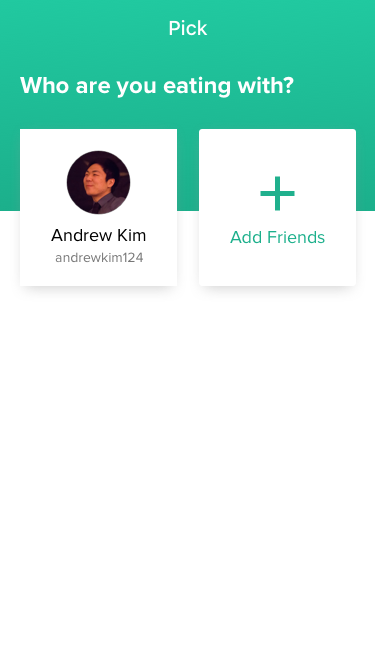
After establishing the basis for the design I was going for, I moved into Sketch to create them in high fidelity. I also did animations for some of the key interactions in Framer.
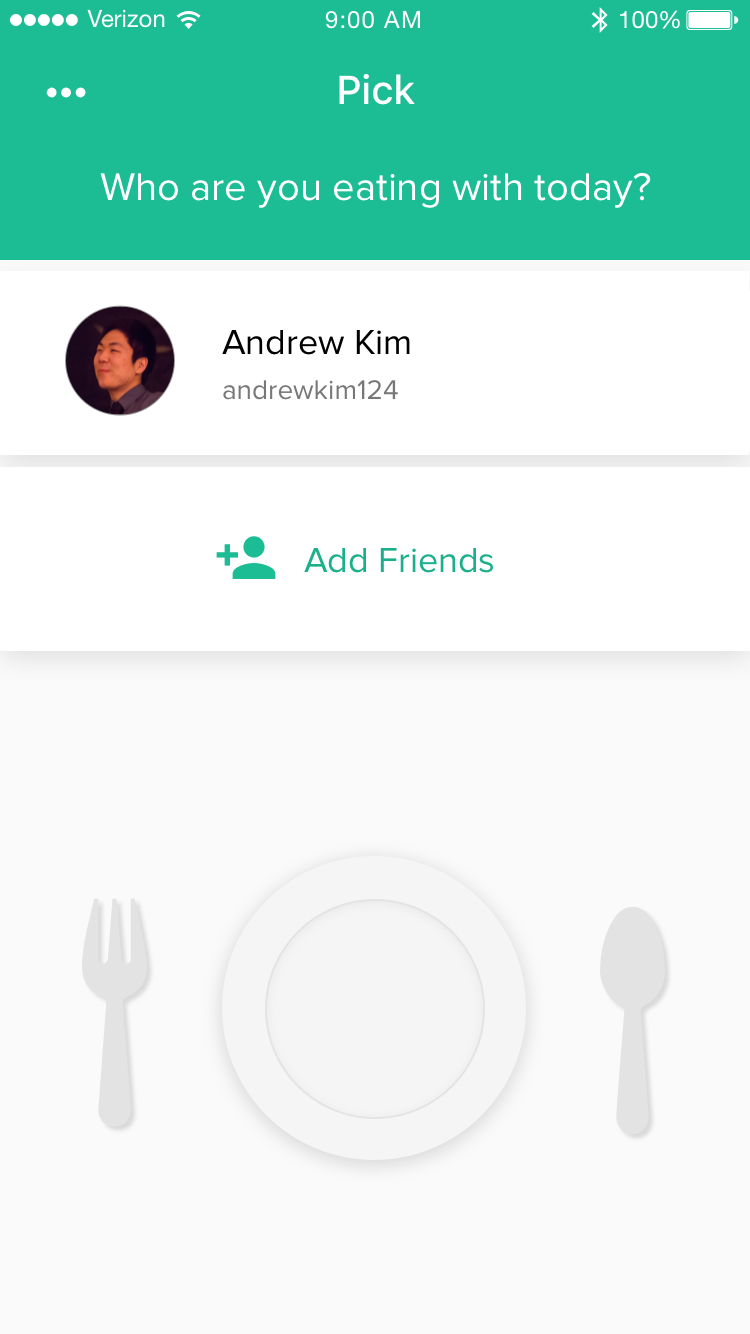
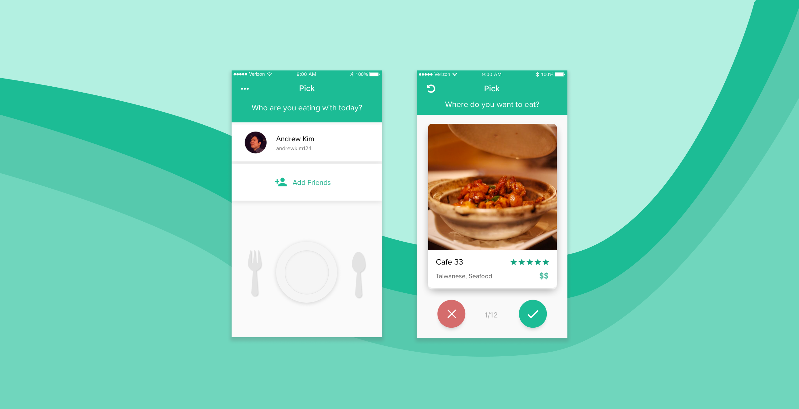
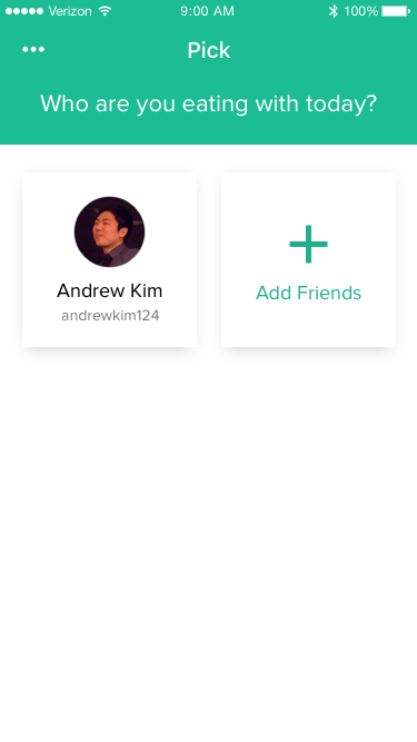
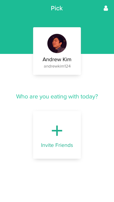
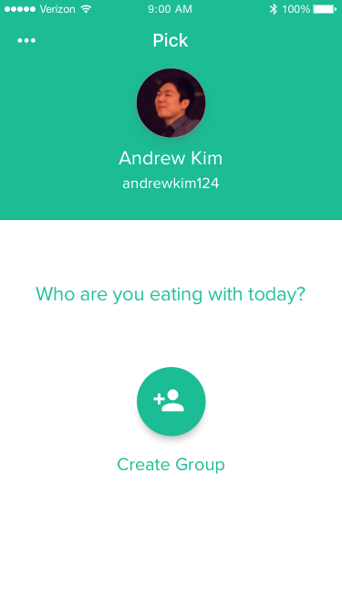
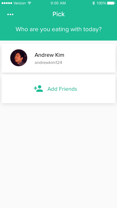
The user is initially greeted with the question "Who are you eating with today?" to guide them towards inviting their friends to form the group. The button text, "Add Friends" could be misinterpreted as adding friends like you would on Facebook so this sets the user in the right direction.
Another thing I added to set the user in the right direction was the plate and cutlery below the user card. Thematically, it establishes a food and eating tone for the app from the get go. And practically, it fills up the big empty space below the "Add Friends" card.
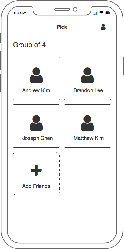
The "Forming Your Group" screens were the ones I struggled the most with, despite it being a simple friend inviting type of process. Something that really tripped me up was my attachment to the square card idea that I had in my initial wireframe. You can see my attempts to force the idea to work in the first four iterations above.
In the fifth iteration, you can see that finally gave it up and tried a new layout. I actually was very very close to going with this version as the final, but I made one more switch to the nearly full width cards because I felt like the other version almost made it seem like you were separate from the group going out to eat.
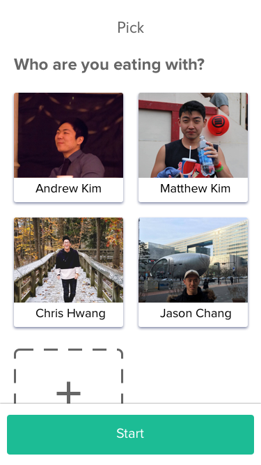
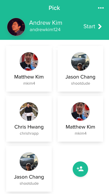
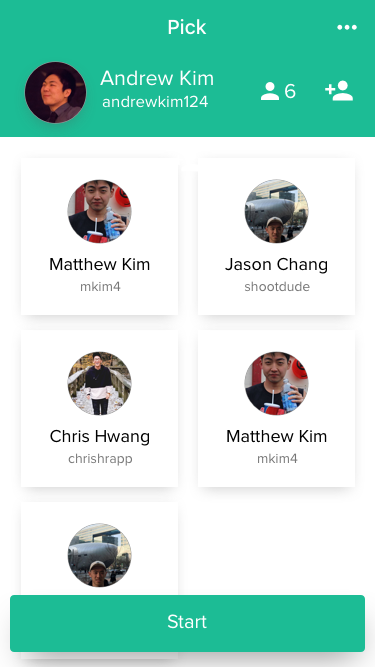
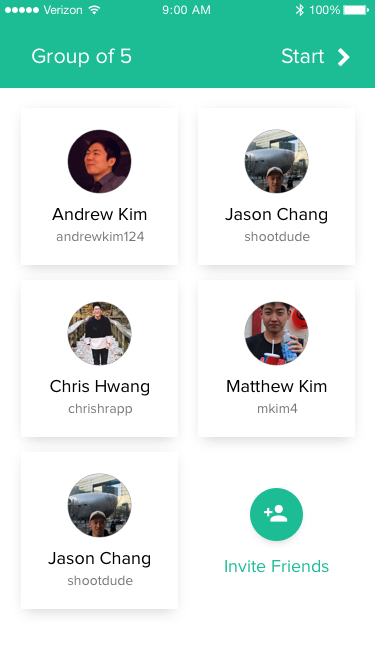
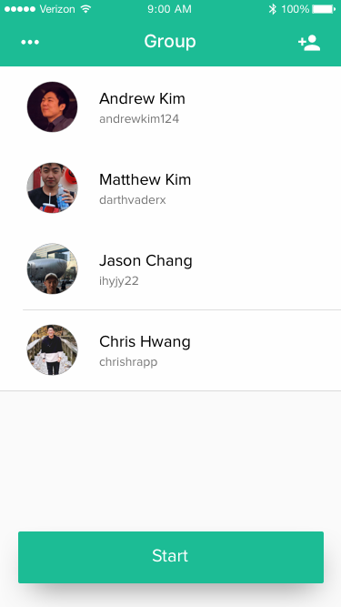
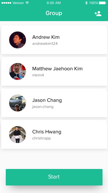
In the assembled group screens, I went back and forth on the placement of the "Start" button, but ultimately decided that having a big start button at the bottom would be the best not just for visual balance, but because it's a lot easier to reach.
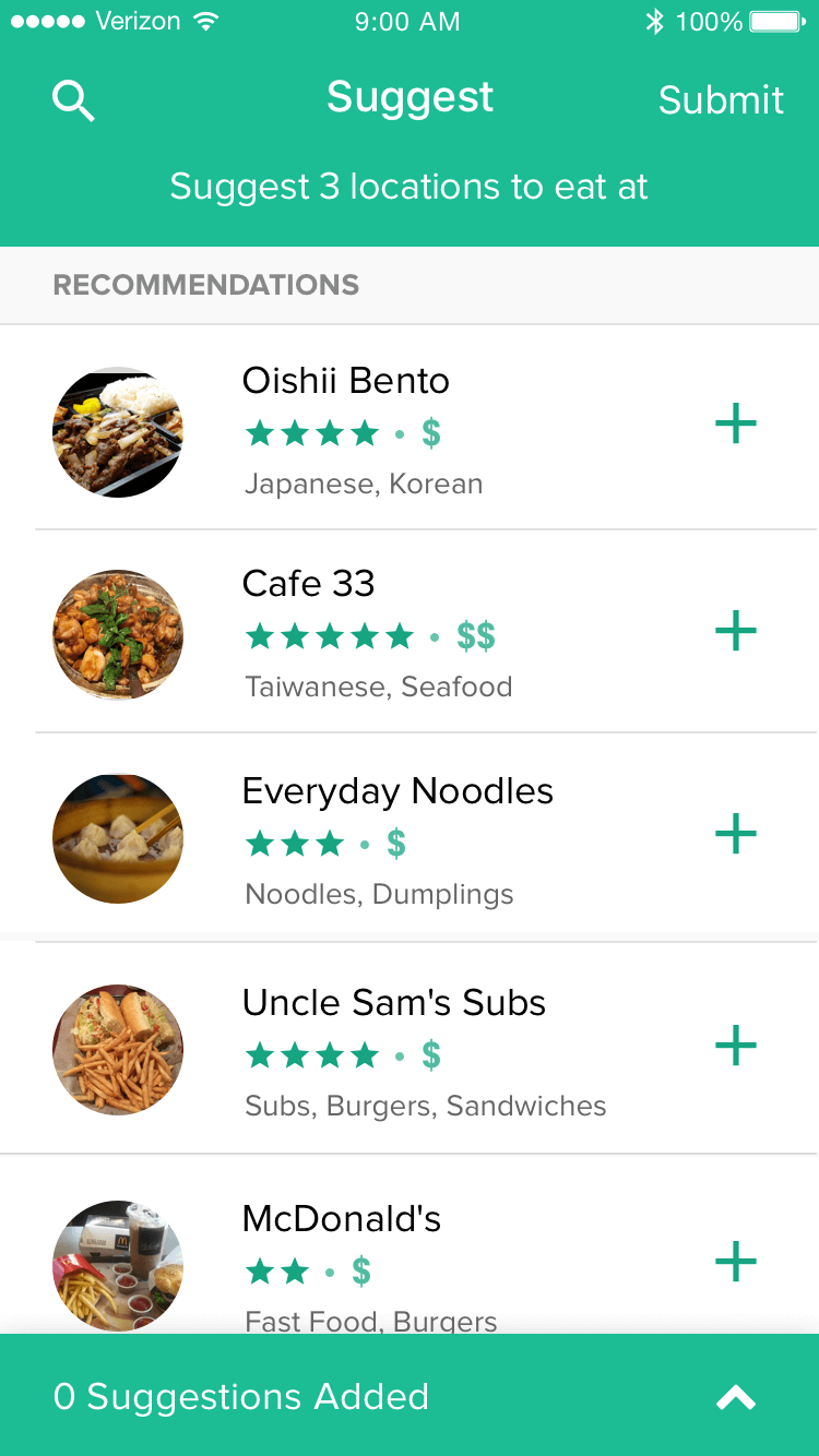
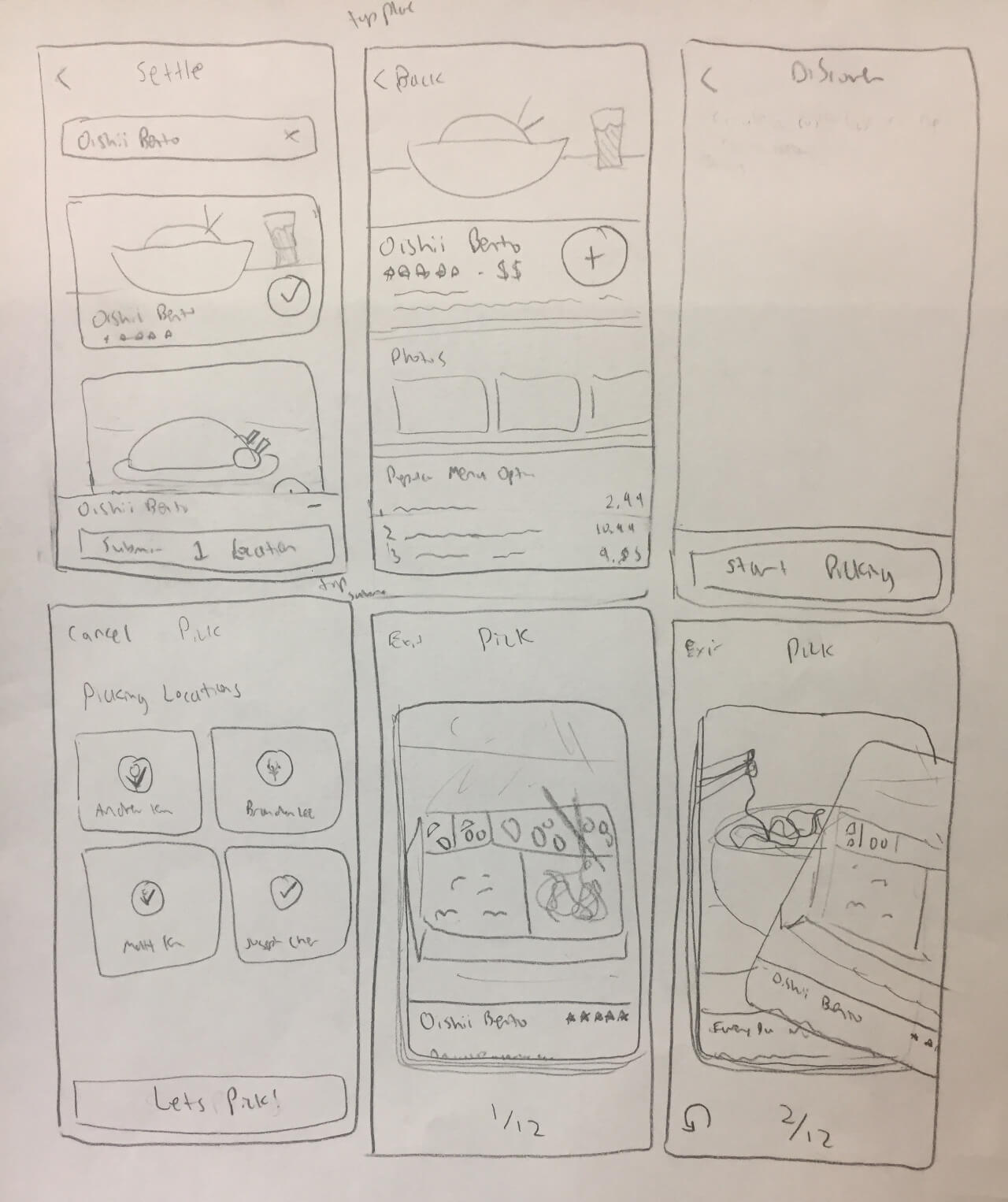
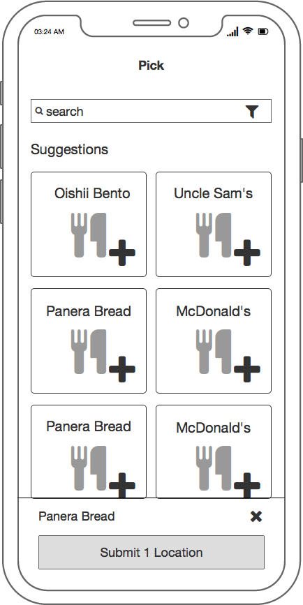
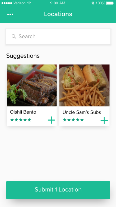
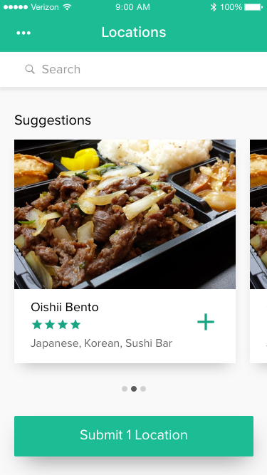
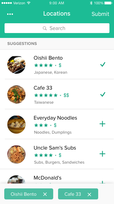
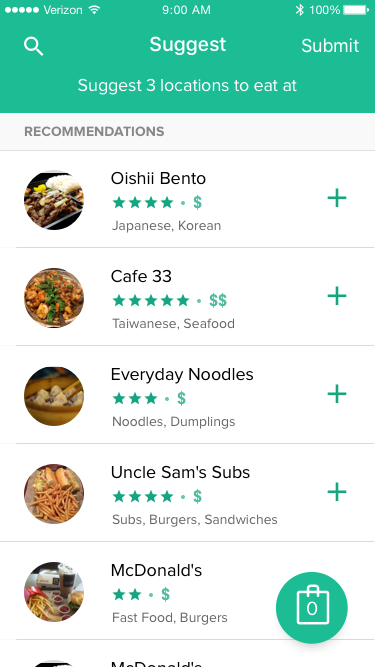
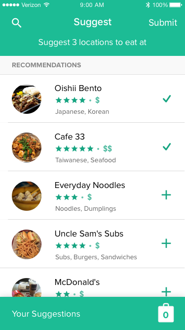
Each member of the group is prompted to suggest locations for the group.
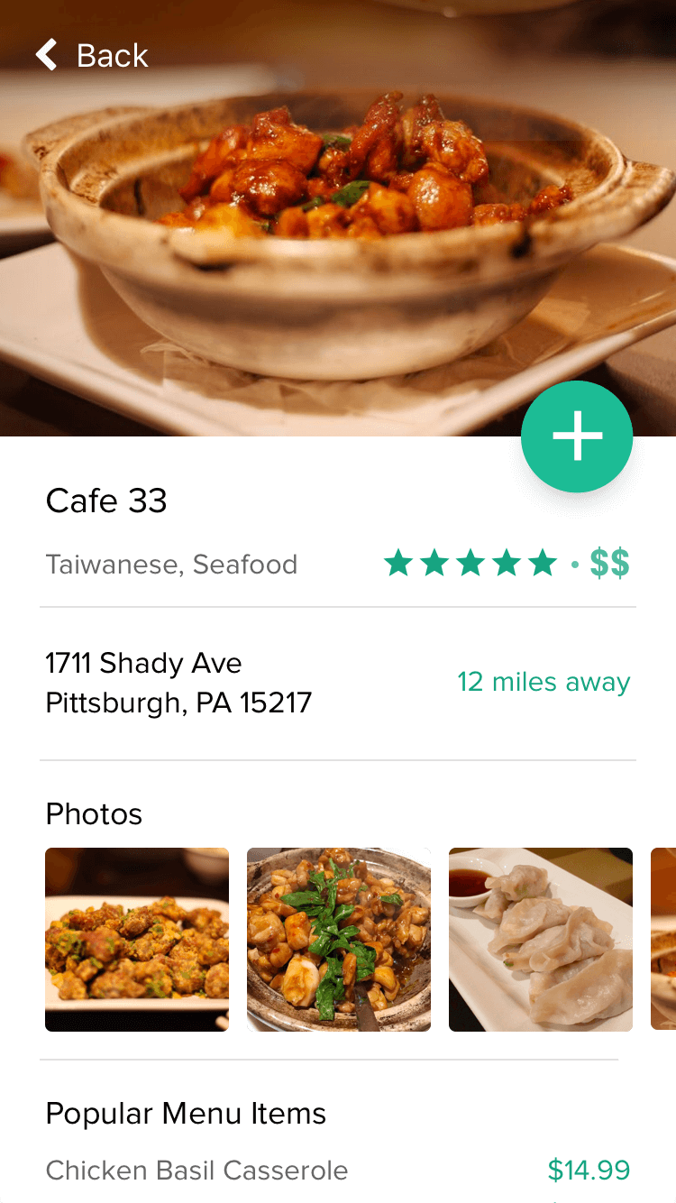
For each location, I included its name, number of stars, price range, and "type" of food. I picked this info because I felt that these were the most salient factors that went into whether or not someone wants to eat at a particular location. After a suggestion gets thrown out, the questions that typically follow are, "Is it good?" or "Is it expensive?", so I made sure to have this info readily available for each location.
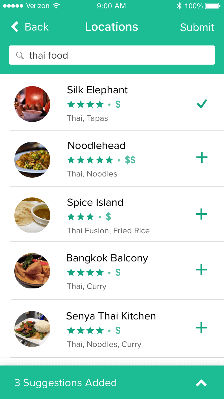
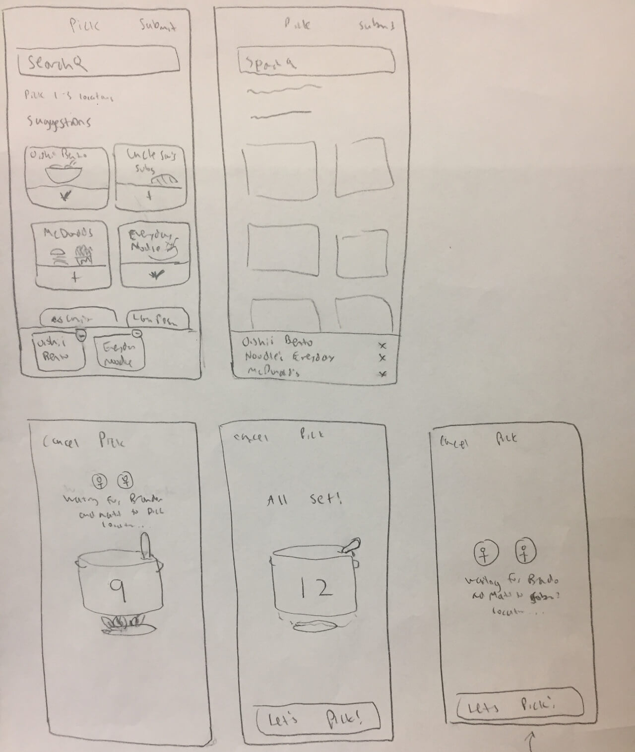
In addition to browsing recommendations, users can search for a location they are craving in particular, or just to find a place that they're interested in, but have not eaten at before.
Here you can see an expanded version of the accordion that contains the user's added suggestions. It has the name of the location and its photo, along with the option to remove it from the list. I was debating whether or not to include the photo, but I thought that, if someone added a location that they were unfamiliar with, the name alone might not be enough for them to reliably remember what it is.
After adding 3 locations, the group member can hit "Submit" at the top right.
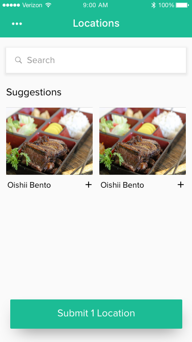
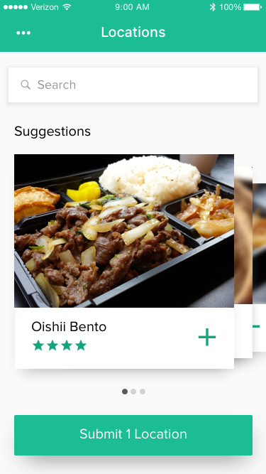
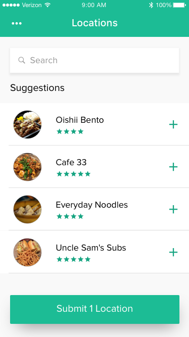
At first, I tried a number of image-centric versions for the suggestions, but I later decided that a list that was quicker to browse and easier to scan would actually serve the user better.
I wanted it to be really easy for people to take in a lot of different locations efficiently so that it's likely that they can gather 3+ places to suggest. The purpose of the app is to come to a decision and not waste time being too selective, so I wanted to make sure people wouldn't get caught up in this part of the process.
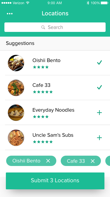
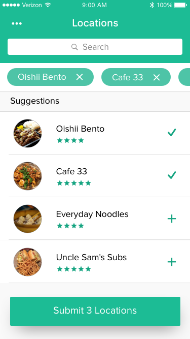
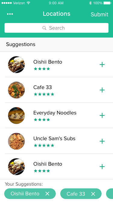
I had a bit of trouble deciding how to show the users what suggestions they had added while they were browsing the locations. My initial idea was to use pills, but they cluttered up the bottom of the screen and looked like search filters at the top of the screen.
I eventually got them to a place I was decently satisfied with (iteration 4), but decided to switch it to an accordion style after a friend showed me how Starbucks' mobile app handles a similar interaction.
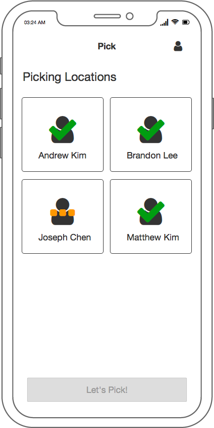
Once a group member has finished submitting their suggestions, they need to wait until the other members of the group have finished submitting.
I had a few ideas with how to do this waiting screen. I was going to do just a simple waiting message that said who was still suggesting (which you will see in a later screen), but felt like it put users into a helpless state where they were unable to do anything but wait. Technically, the user can't do anything in the version I went with, but I felt that the familiarity of the "Group" screen, and being able to see all of the members at once, gave a much greater sense of control in the situation.
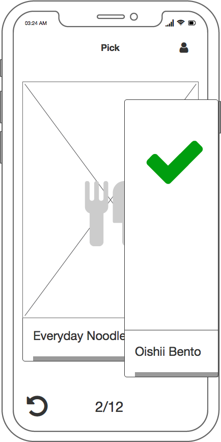
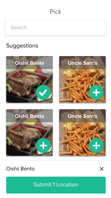
Once all the suggestions are in, the users can get to picking!
The picking process is similar to a number of mobile dating apps like Tinder and Bumble where the user swipes left or right on a card to express preference. If a user does not want to eat a location, he can swipe left or hit the "X" button. If the user does want to eat there, he can swipe right or hit the checkmark button.
This card swiping process is really what I feel is the core of the app because it's enjoyable and efficient. In the past, I had had a project idea very similar to this one where users would submit suggestions into a list and users would take turns removing one location at a time from the pooled list. While I still feel that that is a solid idea, I just thought it was kind of dull.
A lot of times I hear about using design to make experiences delightful and I had never really understood what that meant. With this project, I feel like I was able to make this selection process fun, collaborative, and full of delight!
Once the user is done picking, they will be presented with the result unless there are people that still need to finish picking.
My initial idea for this waiting screen was to have it be in the same format as the first waiting screen for the suggestions, but instead of "suggesting" next to each member who had not finished, it would say "picking". I decided against this because of two reasons. One, it looked way too similar and I thought it might cause confusion in users, especially because the two waiting screens go immediately before and after the picking process. The second reason was because I feel like waiting for picks and waiting for suggestions are different in function and scope of time.
Waiting for suggestions feels like you're still getting prepared for the main task at hand, whereas waiting for picks feels like you're done with the full process, and just waiting for the result to come out. Furthermore, I expect that the picking process typically would take significantly less time than the suggestion process, so the pick waiting screen didn't need to give as much "control" to the user as the suggestion waiting screen.
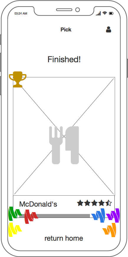
After everyone is done picking, an optimal result based on the preferences of each group member will be presented to everyone.
I wanted to provide each group member with a sense of accomplishment by having a big "Finished!" header and a crown on the winning location card to show that it's the winner. I wanted it to be satisfying and rewarding to finish the process.
This is further reinforced by the animation where the card "slams" in from above the screen.
Credit to the artist of the crown: DinosoftLabs on Flaticon.com.
Something that occurred to me as I finished up this project was the possibility of someone in the group being completely dissatisfied with the result of the picks. Ideally, the optimization algorithm would pick the best place for everyone, but I'm sure there would be cases where it wouldn't be perfect. There's bound to be times where the group in general gets the result and goes, "oh".
To remedy this, I'd want to implement a blacklisting feature. During the picking process, someone could swipe down as a sort of "super dislike" and that place would be guaranteed not to be picked. Another option would be to allow users to swipe away the result and see the runner up, maybe second and third place.