Internship | UX Design
Focus
UX Design, Storytelling
Role
UX Designer
Date
Jun 2017 - Aug 2017
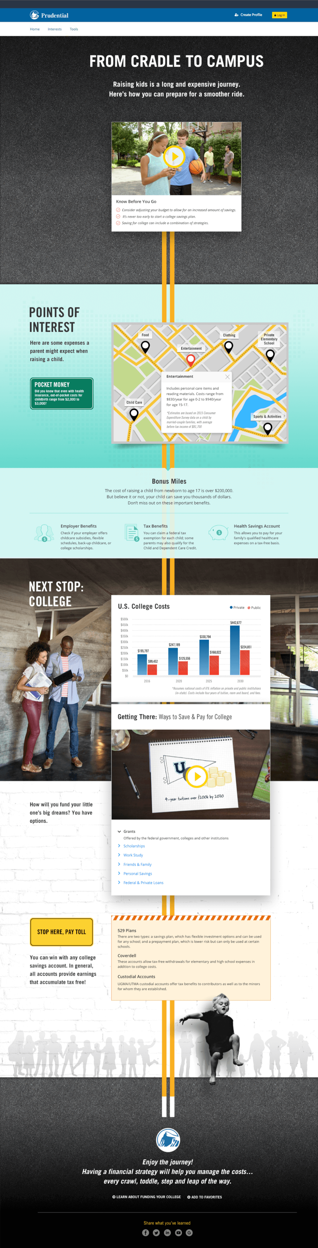
The goal of the project was to create a narrative for the guide that was compelling and implement the content in a way that would keep users engaged and scrolling all the way through the album.
I was responsible for creating the wireframes and visuals for the guide in Sketch. I worked with two of the other UX Design interns on the team, Sara and Ali, to come up with a theme and brainstorm ways to present the guide's content in a creative way.
We started with a whiteboarding session where did a braindump to get all of our thoughts out on the topics and objects that could potentially be related to raising a child through the different stages of life.
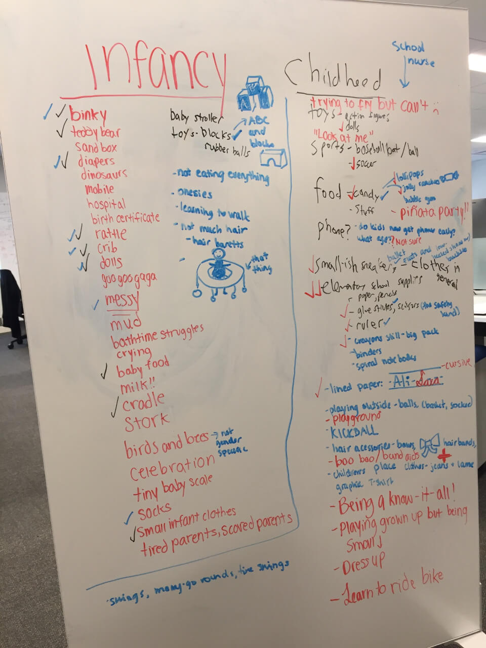
Infancy/Childhood
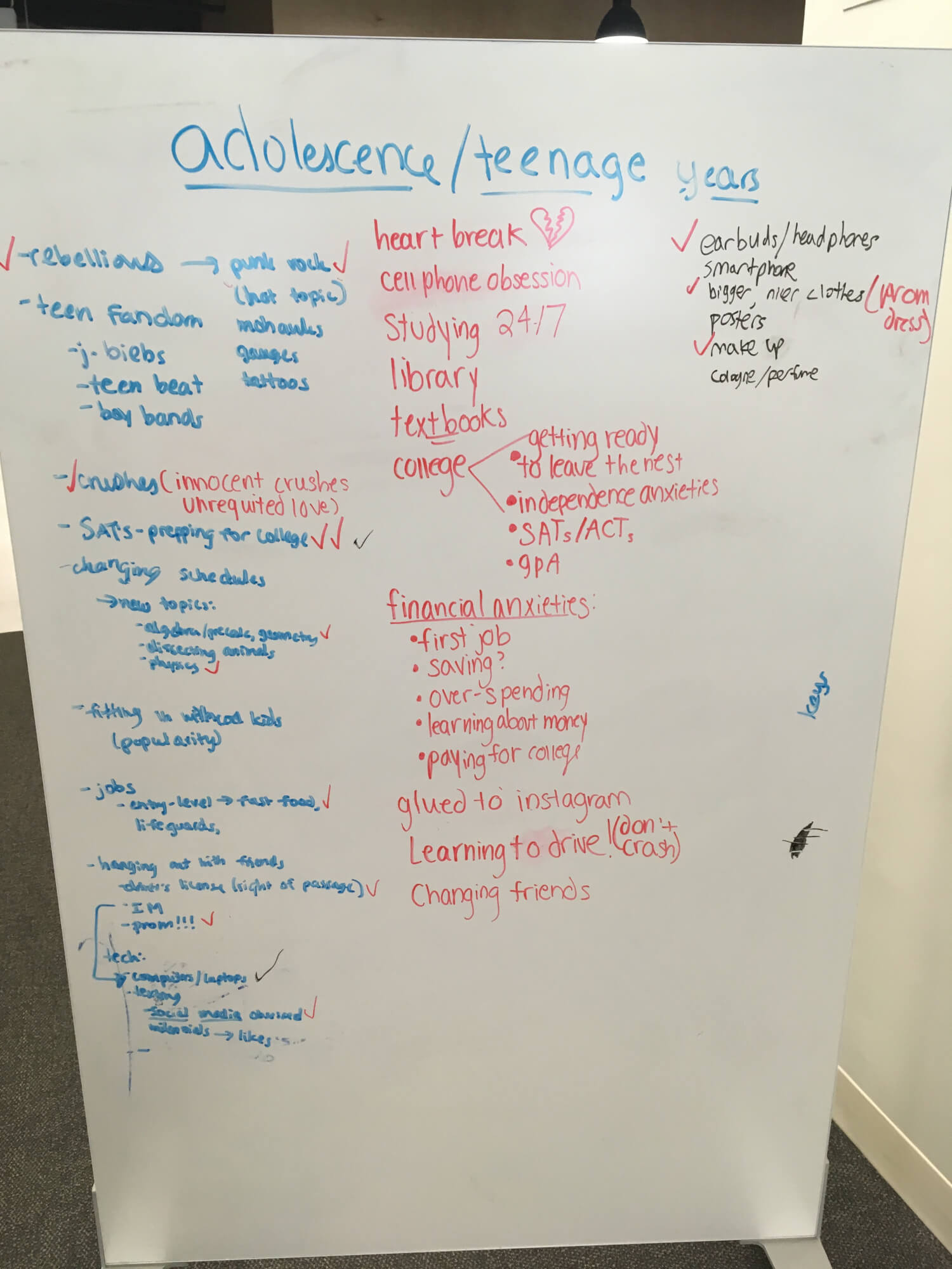
Adolescence
The theme we decided on was a metaphor for raising your child as a journey on a road. Raising a child is a long journey that has many stops and destinations just like a road. We took this metaphor and began to weave it throughout the album. incorporated this metaphor throughout the album.
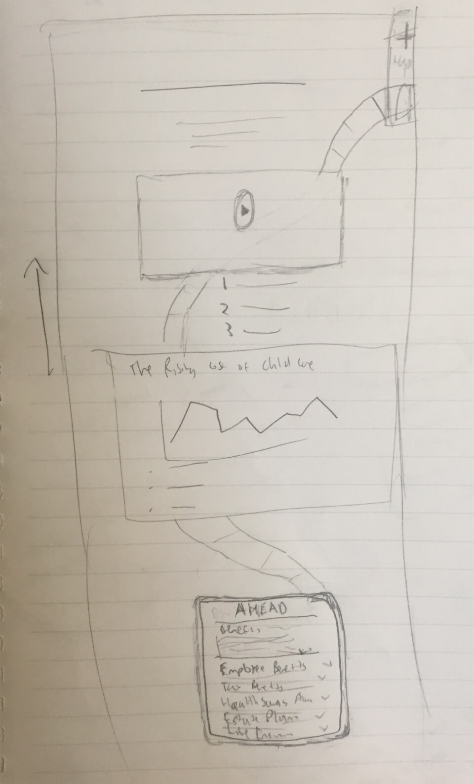
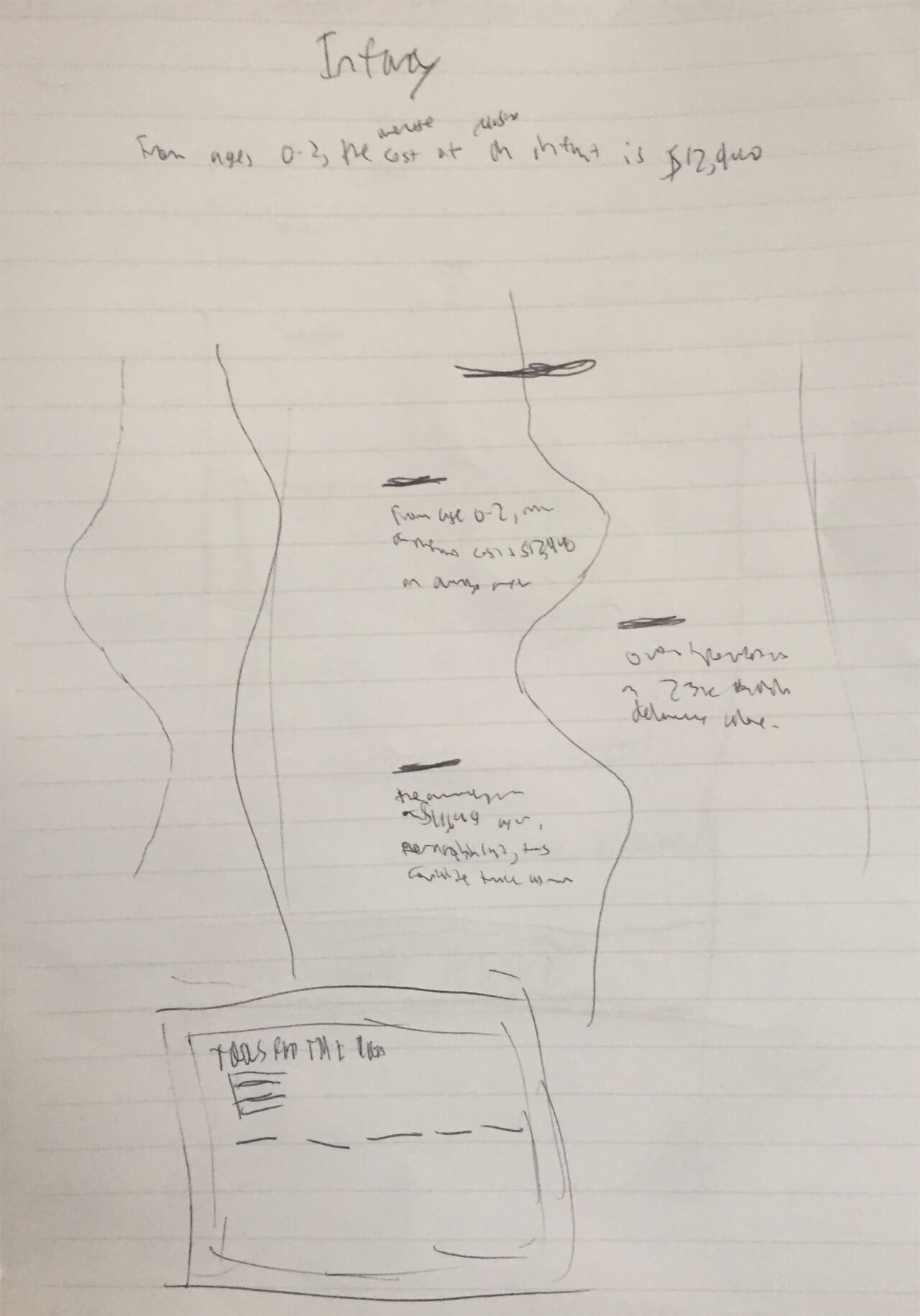
I made some sketches of different road-related components that could be used to present information about raising your child:
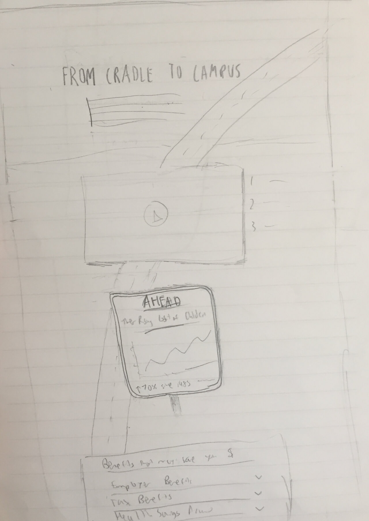
Early sketch of the first part of the album. Includes the introductory video and a street sign about the rising costs of childcare
Another version of the first part of the album. This time with no sign and part of a hospital in the background
Playing around with the shape of the road and how content will be placed around it
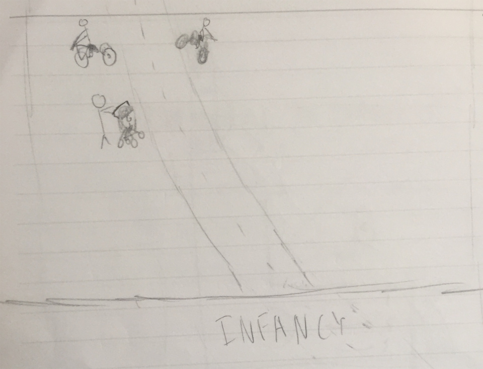
Early sketch of the infancy to adolescence transition through "vehicles"
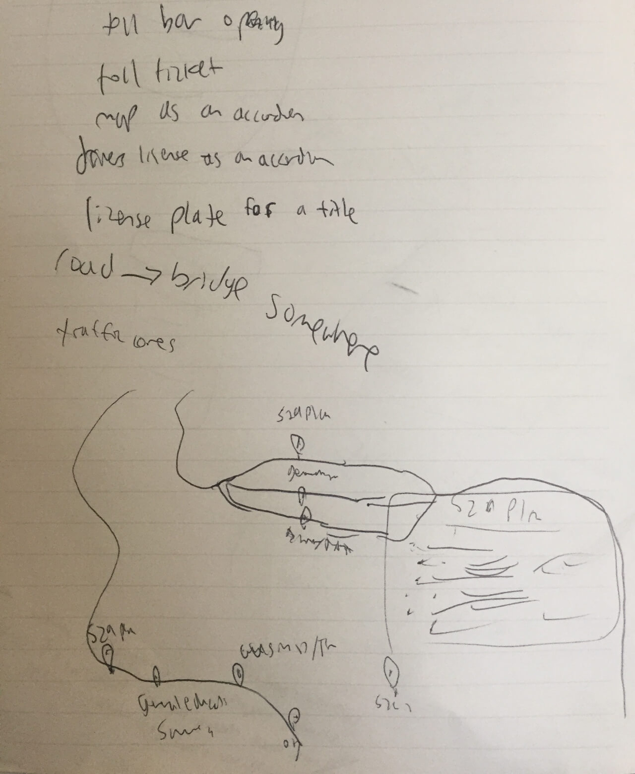
Ideation for different ways to display content through journey related metaphors
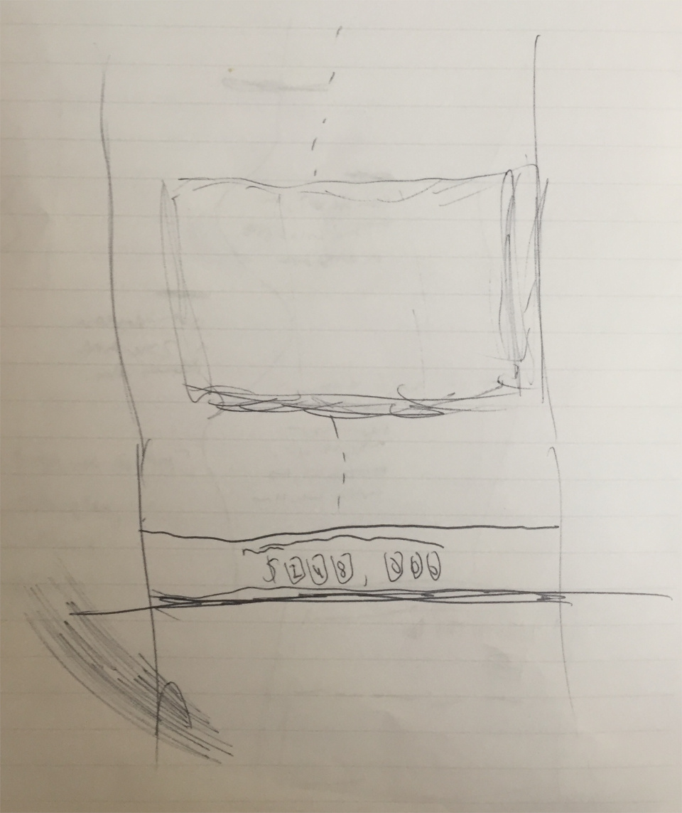
Visualizing a breakpoint in the album where the total cost up through college is presented as mileage
Because the album revolved around how to best manage money while raising your child from infancy to college, we structured the content pieces in a chronological manner. Starting off with tips and stats related to the child's infant years and continuing through childhood, adolescence, and finally college.
I created the following components that tie in the road metaphor to raising a child:
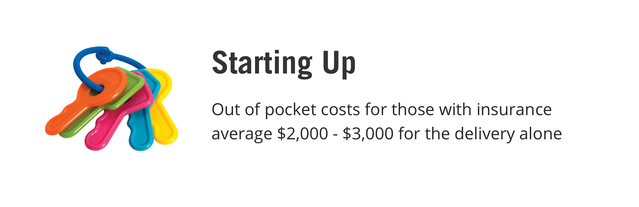
Infancy - Toy keys play into the road metaphor and pertains to the life stage of infancy
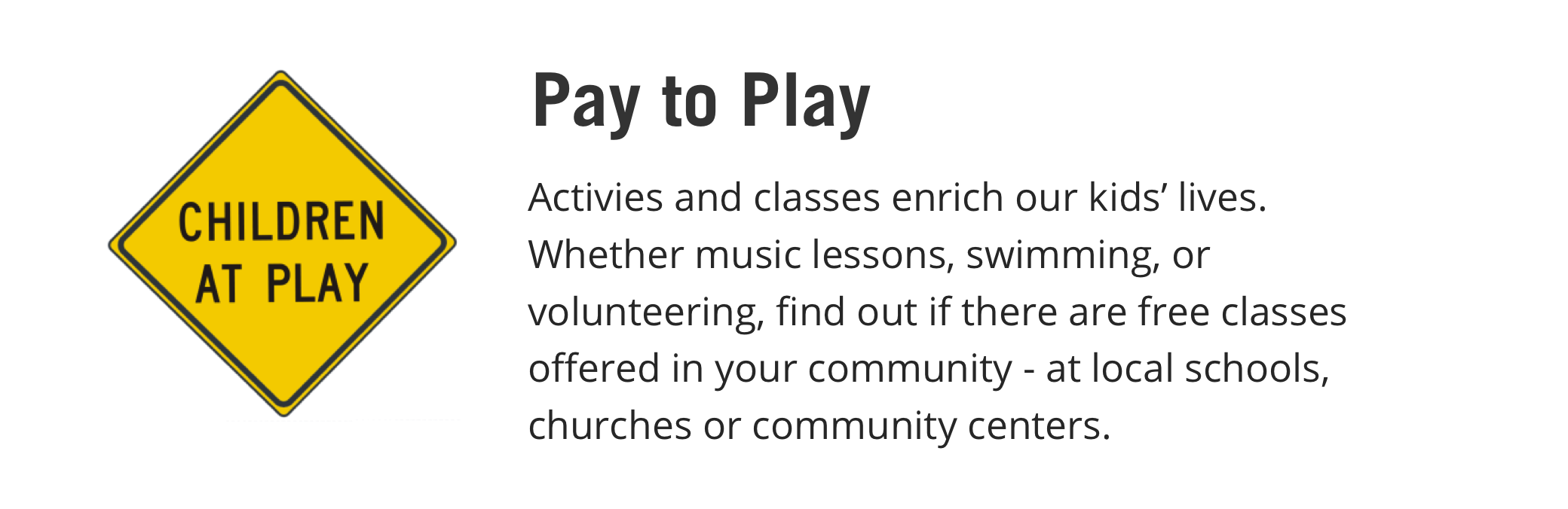
Childhood - Street sign relates to the road metaphor and the accompanying content
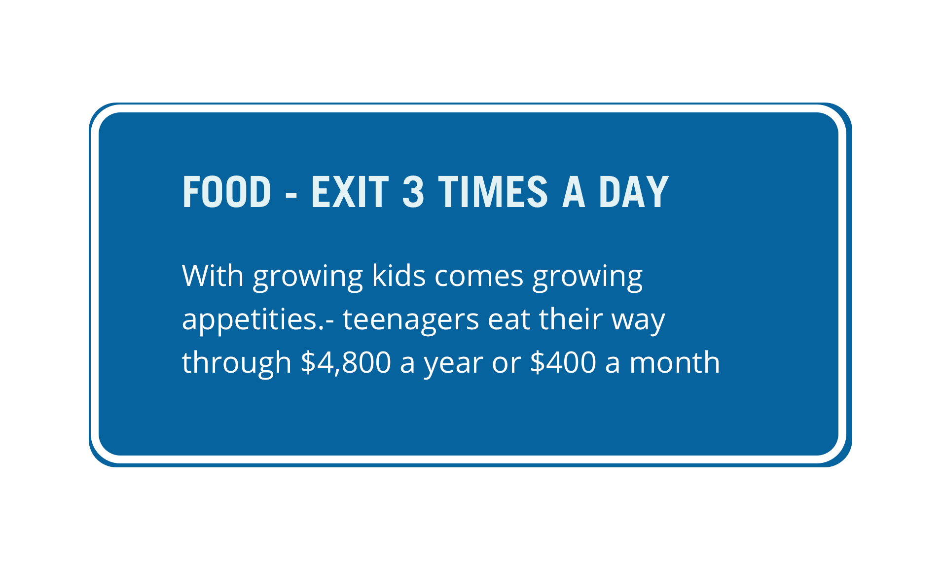
Adolescence - Content is displayed in an exit sign
College - This display, reminiscent of a dial you might see on a car dashboard, doubles as a tool to calculate college costs
College - Financial solutions for parents who have a child are presented within a map
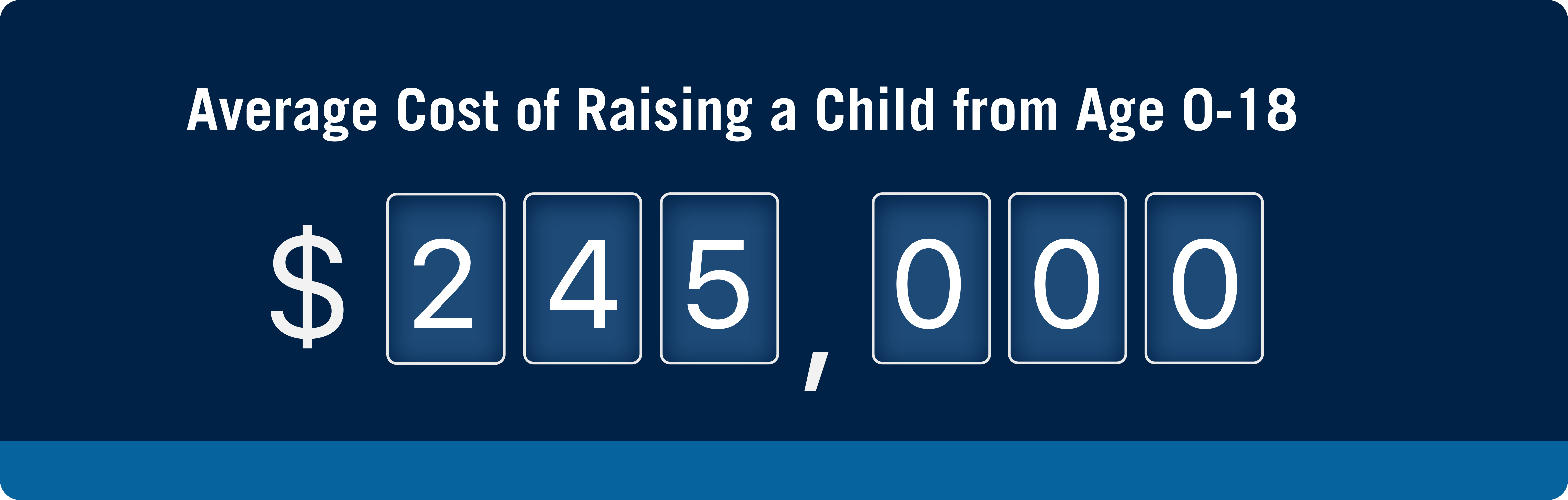
After the first three life stages, the user is presented with the total costs of raising a child from infancy to college in an odometer-like display
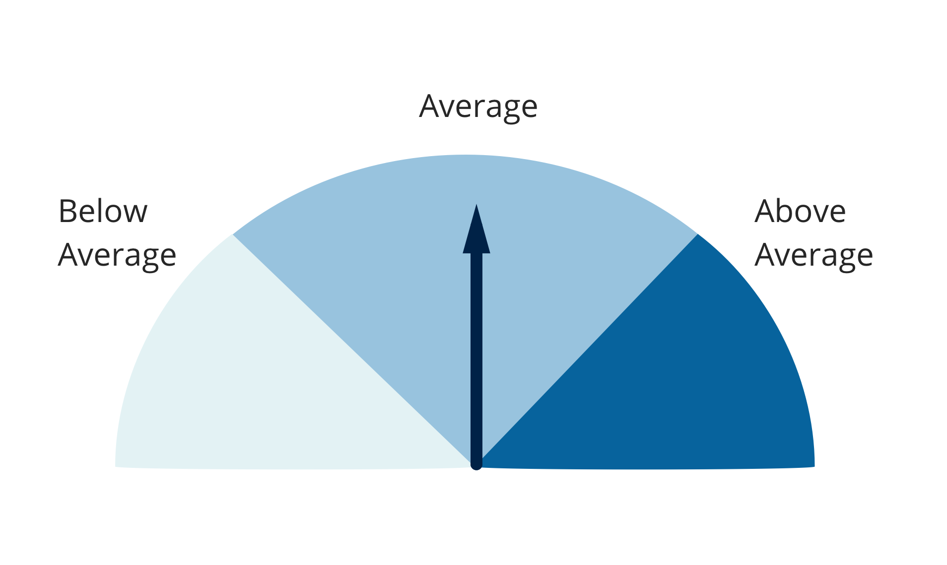
One concern that was raised during a review with the design teamwas that the narrative needed to maintain a temporal perspective as opposed to a strictly physical perspective. We needed to make sure that it was still clear that the content of the album was spanning time and not distance as the road might suggest.
I came up with the idea to include a "vehicle" that evolved as the user scrolled down through the different stages of life. It would start off as a stroller during infancy, and as you scroll, it would change into a bike around childhood, and finally a car during adolescence and college. This consistently re-establishes the passage of time in the album and reinforces the road metaphor.
Credit to Ali Fung for these illustrations.
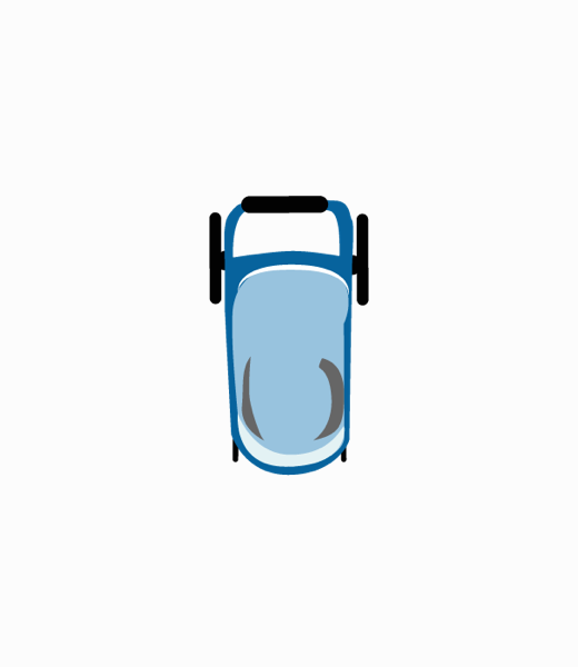
Infancy - Stroller
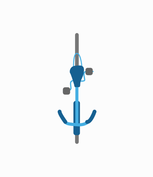
Childhood - Bike

Adolescence + College - Car
I put together the following web and mobile wireframes using the components from the previous section:


When we presented our wireframe to the product team, they expressed that the large, bold number that told parents the costs of raising a child from 0-18 was intimidating and would just cause worry. We wanted to provide information and solutions, not scare away the idea of having a child, so we ended up removing it altogether.
There were also a number of changes to the copy of the album, mainly changes that shortened the content because many people thought it looked too busy.
After making revisions to the wireframe, we handed it off to our visual designer, Steven who created a great final version of the album. (Please note that this is not my work)
After we were finished, the album was added to the series of "My Financial Wellness" albums that Prudential offers. It was a great experience learning how to reinforce a metaphor through visuals and was a fun way to get my feet wet with the design process!
Focus
Redesigning, Rebranding
Role
UX Designer
Date
June 2017 - August 2017
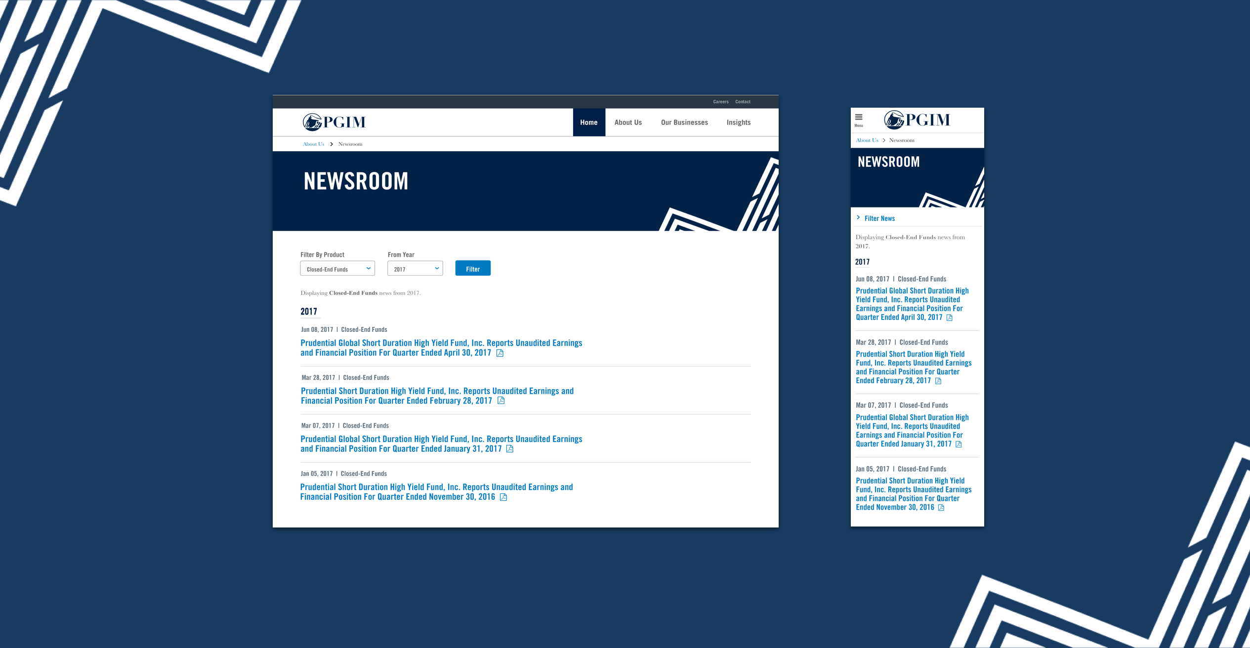
The goal of the project was to redesign the legacy "Prudential Investments" pages to fit the new PGIM Investment brand guidelines.
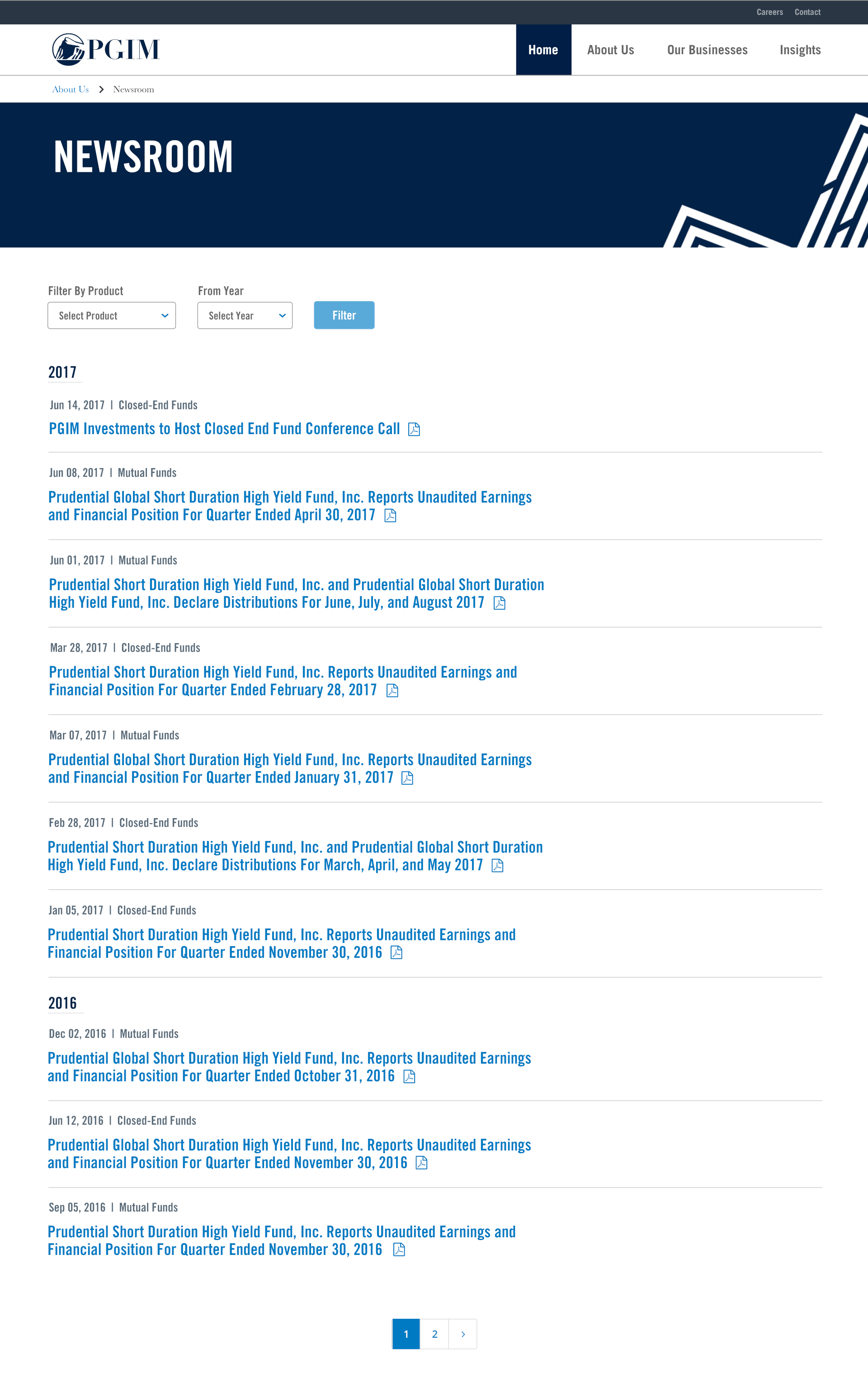
I was responsible for redesigning the "Newsroom" and "Corporate Actions" pages. In addition to updating the patterns, colors, and typography, I adjusted the layout of the pages and added filters in anticipation of our users' needs on each page.
I was actually originally tasked with designing this page alone (Closed-End Funds Press Releases), but we found later that it was going to be merged with the "Mutual Funds Press Releases" page into one "Newsroom" page.
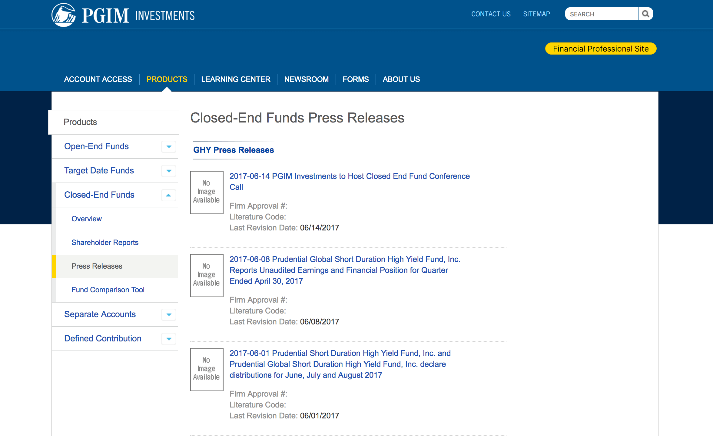
Newsroom legacy page
I started off by making a note of what information I had to keep from the current page.
This included:
I found that almost all of the press releases fell into one of two "types": Declarations of Monthly Distributions, and Unaudited Earning Reports. I decided to add a filtering function so that users could filter on the type of the release and added the type of each release to above the title to make it easily scannable.
The first version I made was a list of the press releases with their type and date separated out. I wanted to do some changes to the titles in order to make it more concise and readable, but due to business and legal concerns, it was decided that it was best not to.
Note that the page hero says "Closed-End Press Releases" as the first few designs were made before knowing it would merge into a single Newsroom page.
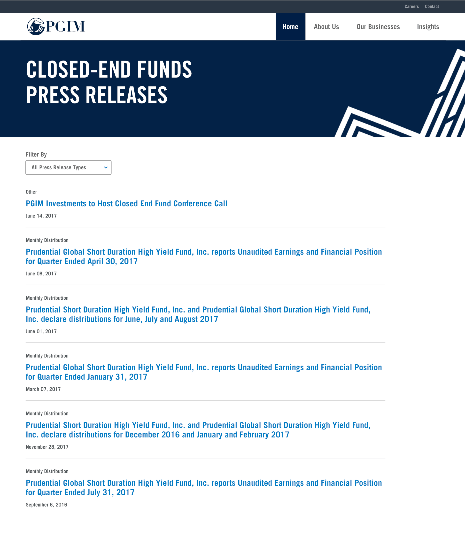
Newsroom Page - v1
After several internal reviews with lots of great feedback, I made a number of adjustments and additions:
The changes for accessibility were something that I had never considered before the internal review. It was interesting to me to see what needed to be added/changed to accomodate screen readers like the 'Filter' button and the PDF icons. Accomodations for visibility like needing to underline link text that failed a 2.5 color contrast with adjacent text were also completely new to me.
I made an effort to decrease the length of the title by pulling out the "time period" for each release (i.e. 'For Quarter Ended January 31st'), but I later found that this info was not parsable. I also tried to see if the fund names could be abbreviated, but this also turned out not to be possible.
With the first round of changes in mind, I started on my second version of the redesign, this time, with mobile and filtered versions as well.
Desktop Newsroom Page - v2
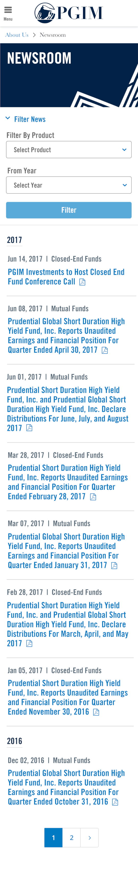
Mobile Newsroom Page - v2
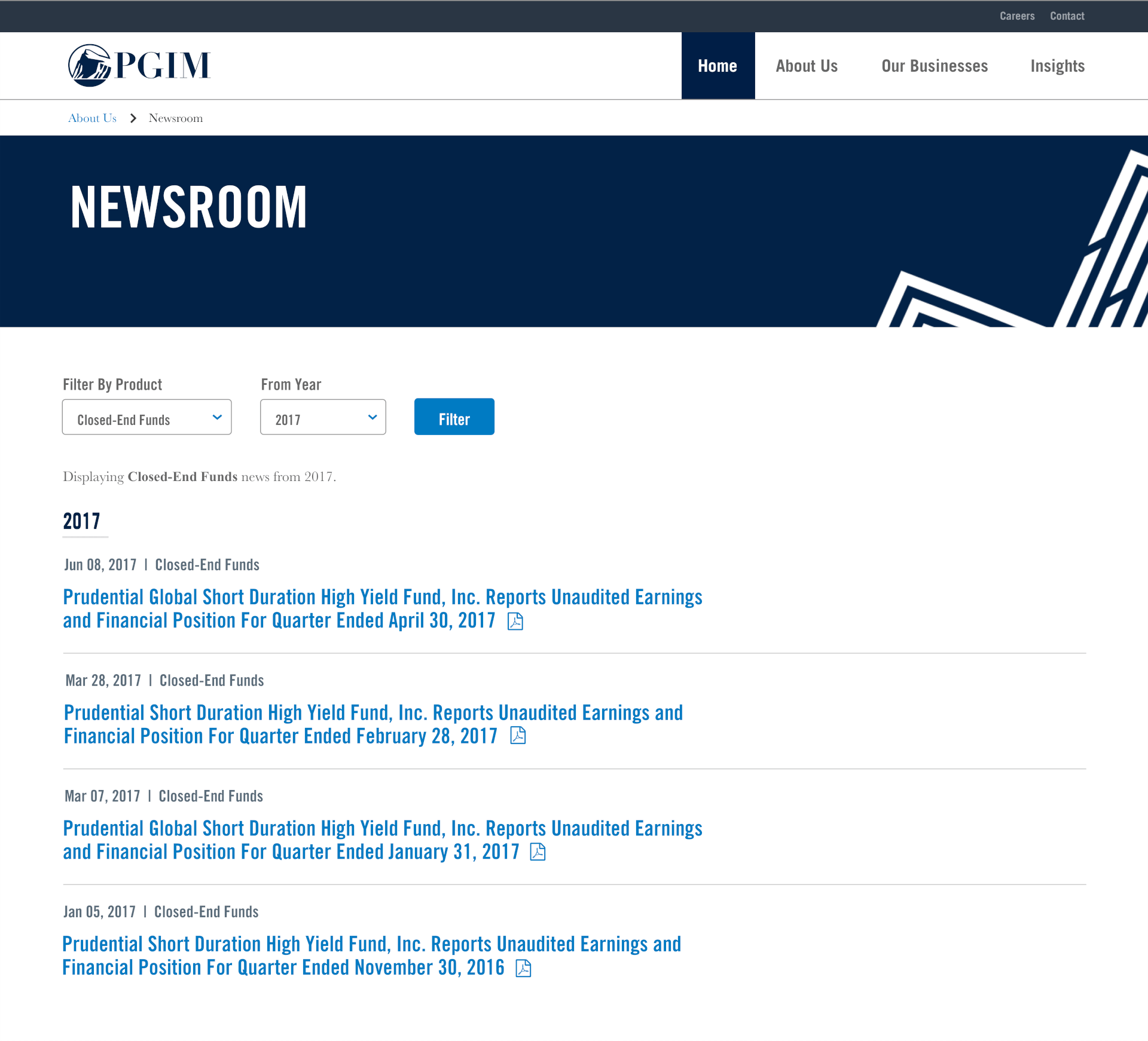
Filtered Results - Desktop
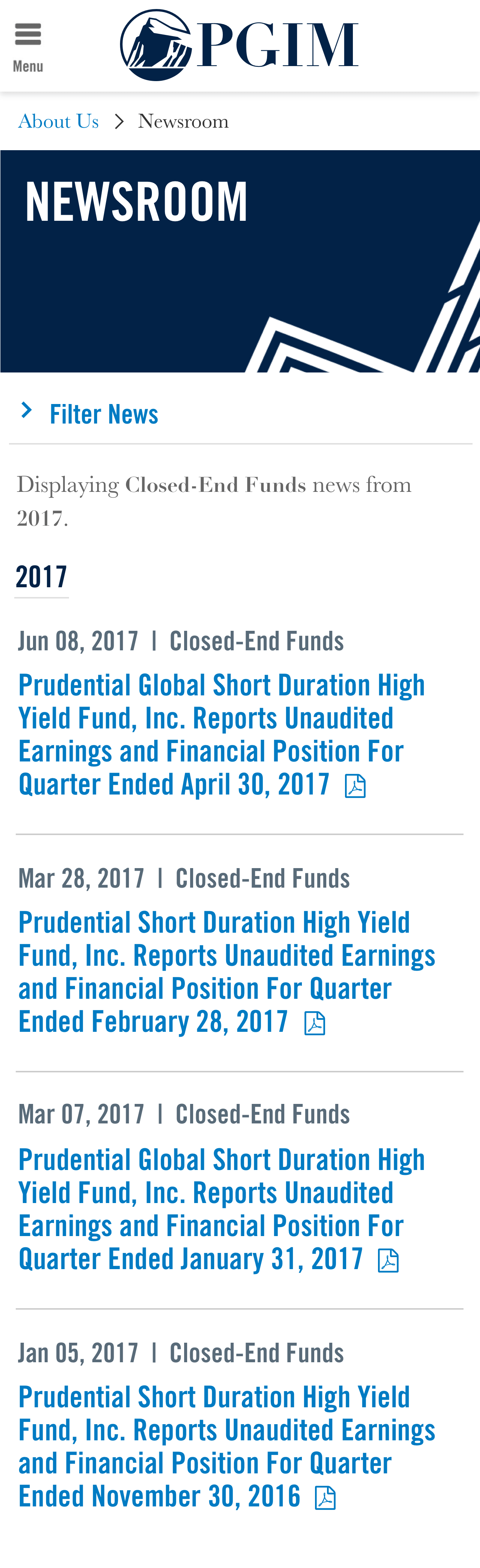
Filtered Results - Mobile
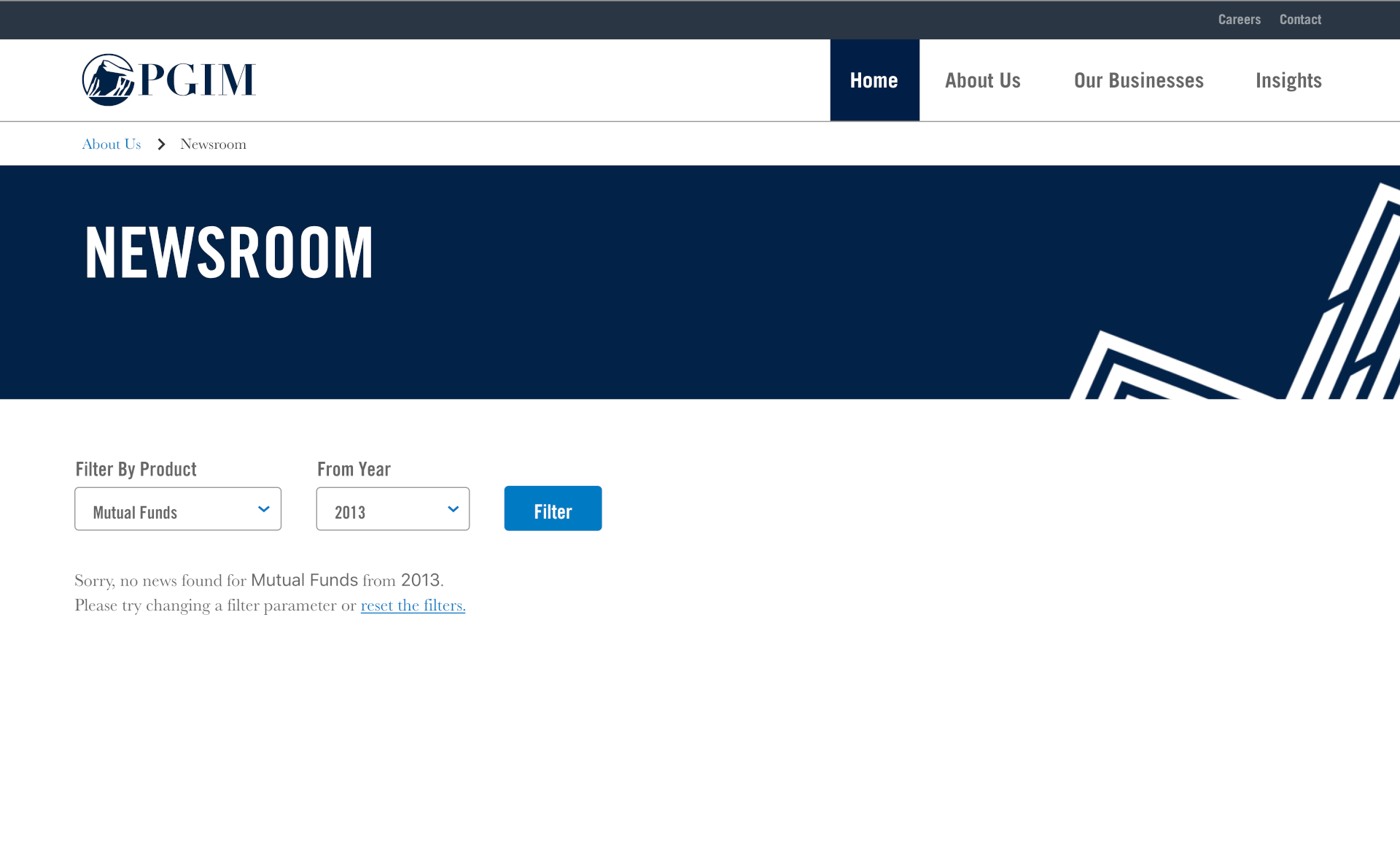
No Results - Desktop
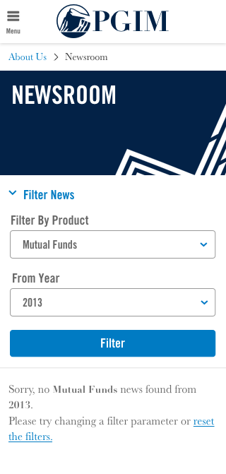
No Results - Mobile
Interning at Prudential was a great experience. The managers and supervisors that I had were really, really, really awesome. I can't overemphasize enough how helpful and supportive they were throughout the duration of the internship. I knew that they genuinely wanted me to improve and succeed as a designer; I'm super grateful for the opportunity they gave me.
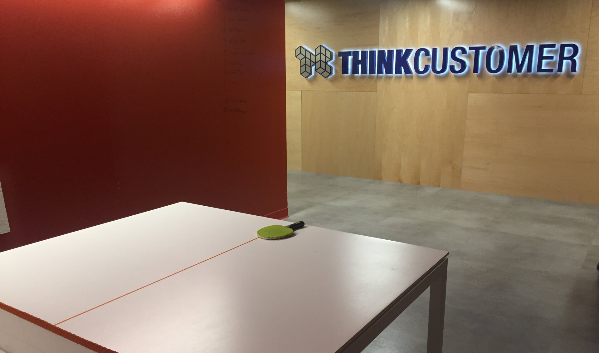
Eighth floor hallway where the design team sat!
I learned so much about the details of how UX design teams work and the way they interact with product, business, development, and content teams. There were a lot of things I had never considered for like a class project such as meeting ADA standards, development feasibility, and the importance of clearly communicating your design choices.
Group photo with our managers, Brian and Miraj
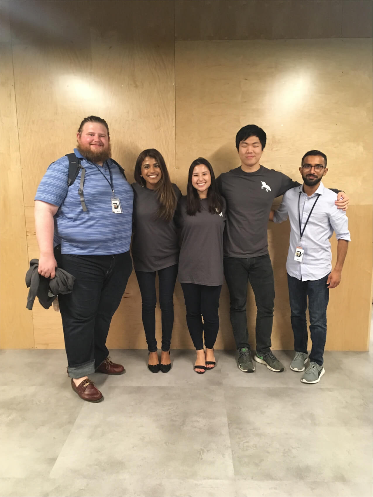
Posing with the other interns
I had a really awesome time working as a designer at Prudential, I had a lot of fun day-to-day and I felt like I was working on genuinely important projects. This internship helped solidify design as the career I wanted to pursue!