Side Project | Visual Design, Animation
Focus
Visual Design, Animation
Tools
Sketch, Framer
Date
Spring 2018
The root of the idea for this application came from my sophomore year at CMU when I was roommates with someone who journaled frequently. One day, we were talking about his journal and he asked me how many times I thought my name would come up if he CTRL + F'd my name (he kept his journal in a Word doc like I currently do). I dismissed the idea but I found it fascinating and wanted to see similar statistics for my own journal.
From my personal journal, I found that I often wrote about recurring topics so I wanted to allow people to tag the topics that they wrote about within their journal entries. With these tags, along with other stats, they can visualize data that gives insights into their own life through their journal entries.
I wanted to provide a clean interface that made it easy to tag topics and make it enjoyable + interesting to read over past entries and view stats on their journal.
As usual when I am starting off a project and need to get ideas out of my head, I begin with paper sketches.
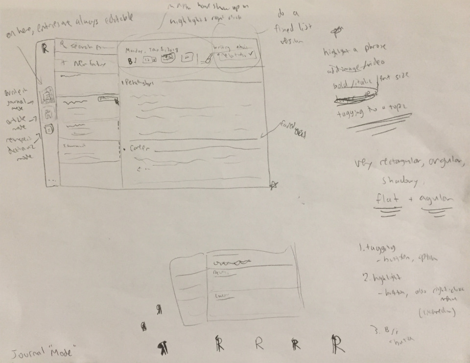
Initial sketch for the journal screen along with some design notes and logo ideas
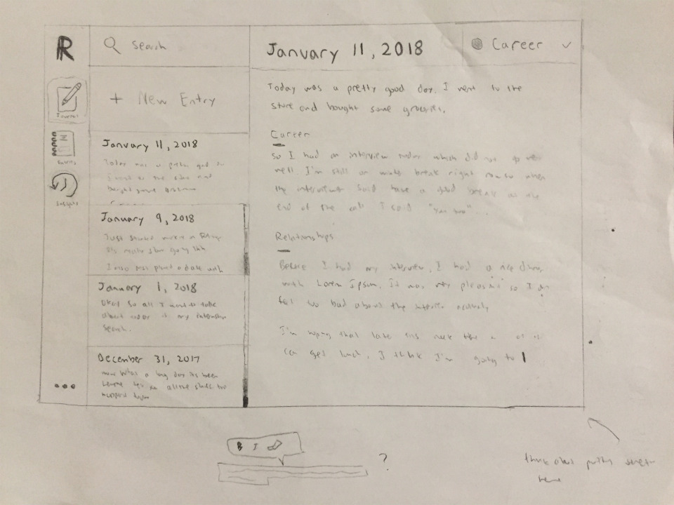
Higher fidelity, refined version of my initial sketch
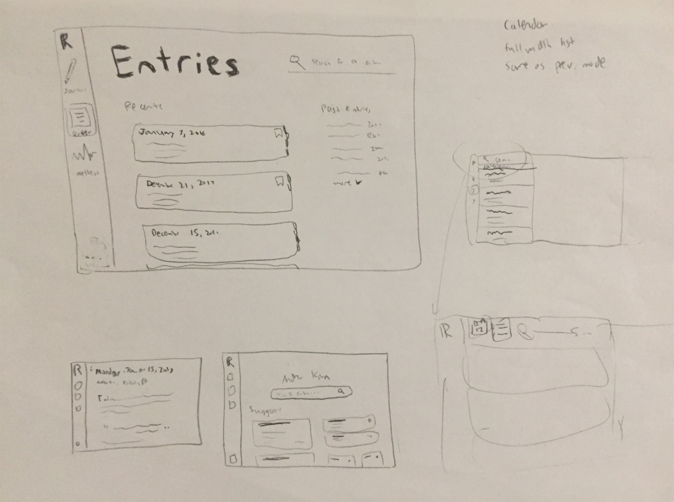
A few ideas for the entries page
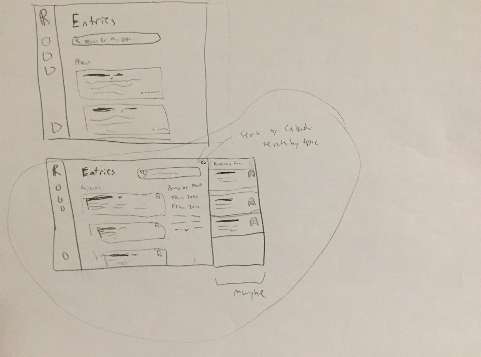
Additional versions with a calendar view idea
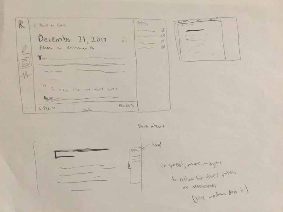
Rereading entries in an "article view"
Considering ideas for moving through entries
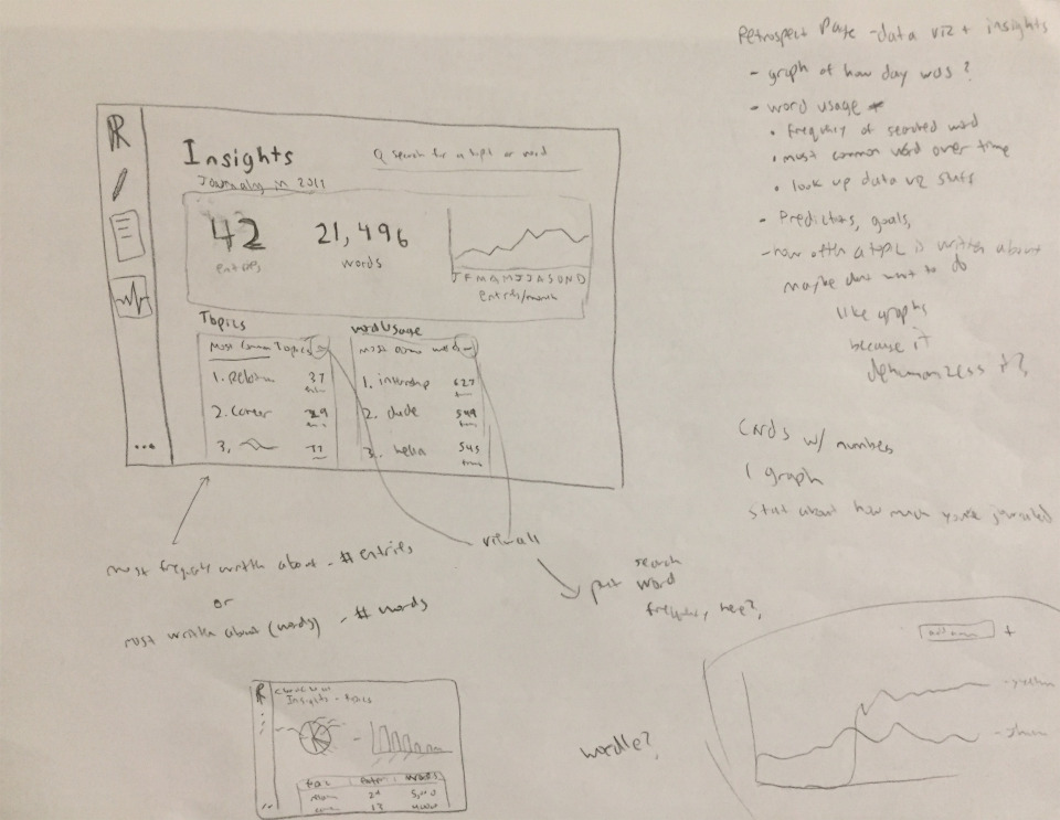
Insights dashboard with notes on what would be interesting
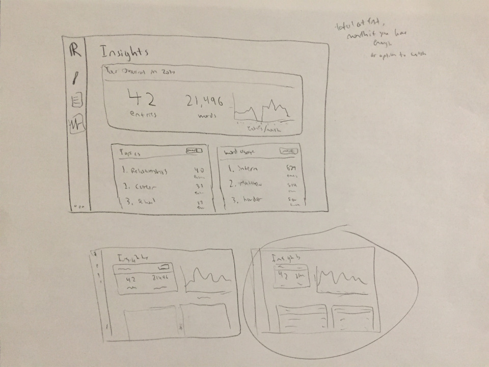
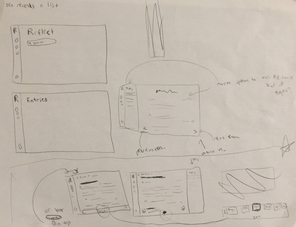
Picking between a few different layouts
Next, I moved into Sketch to create higher fidelity mockups of the wireframes I had.
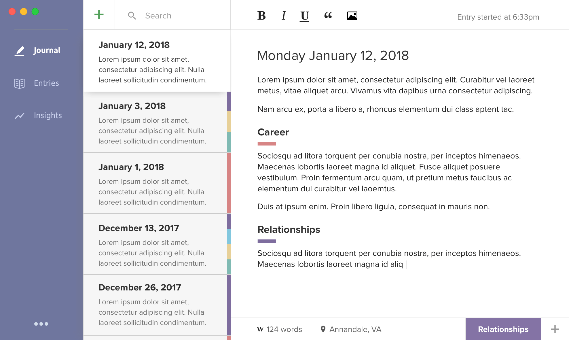
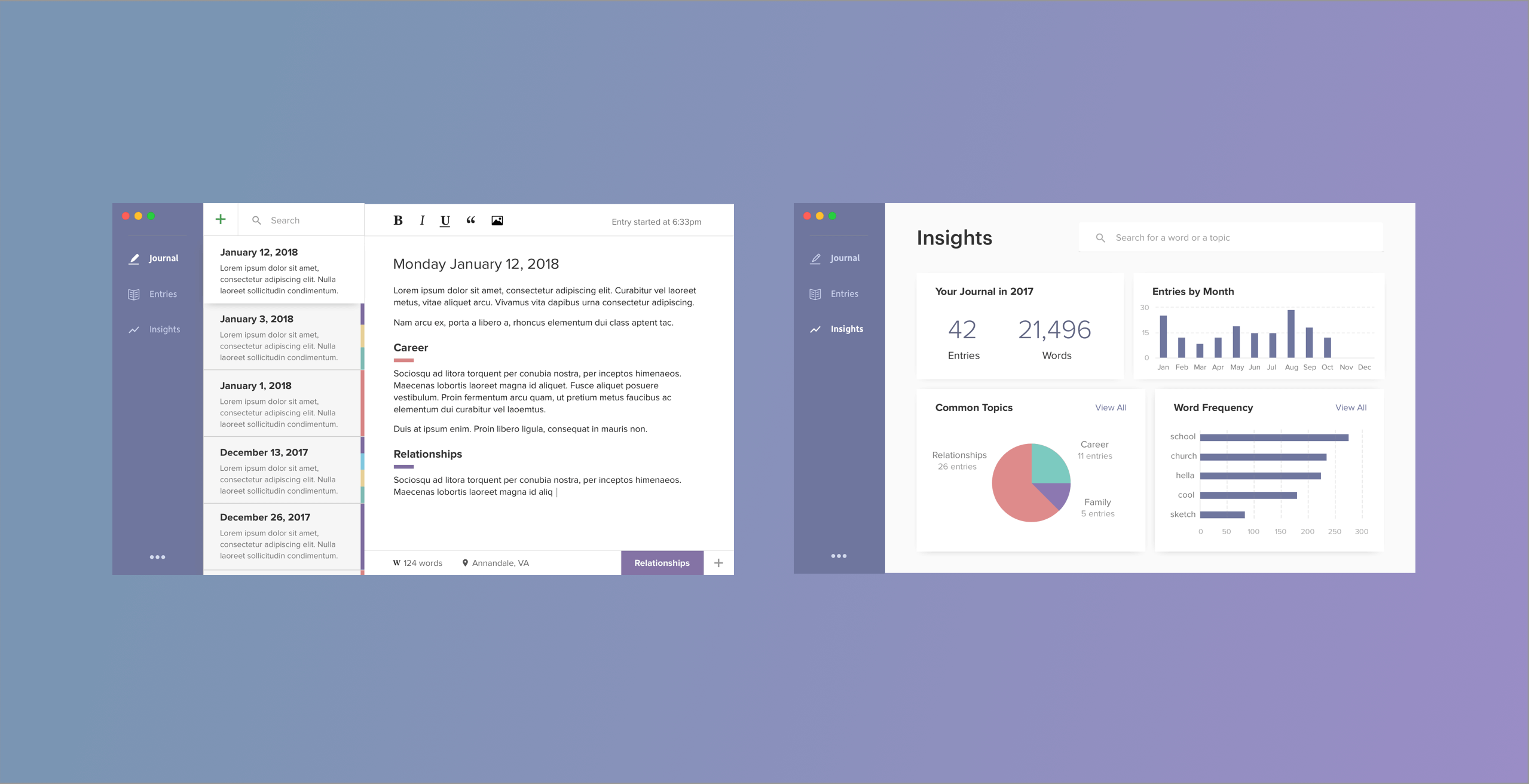
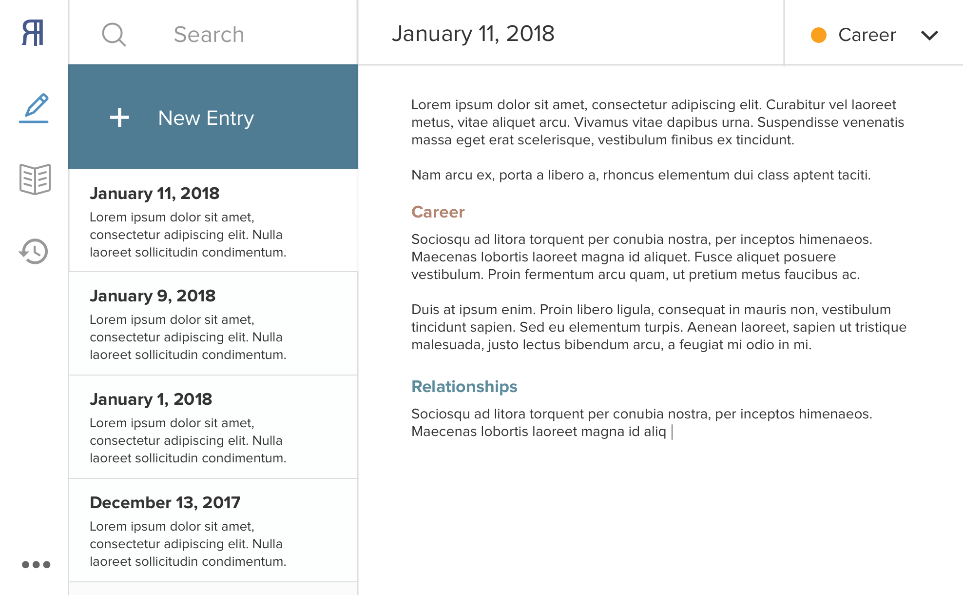
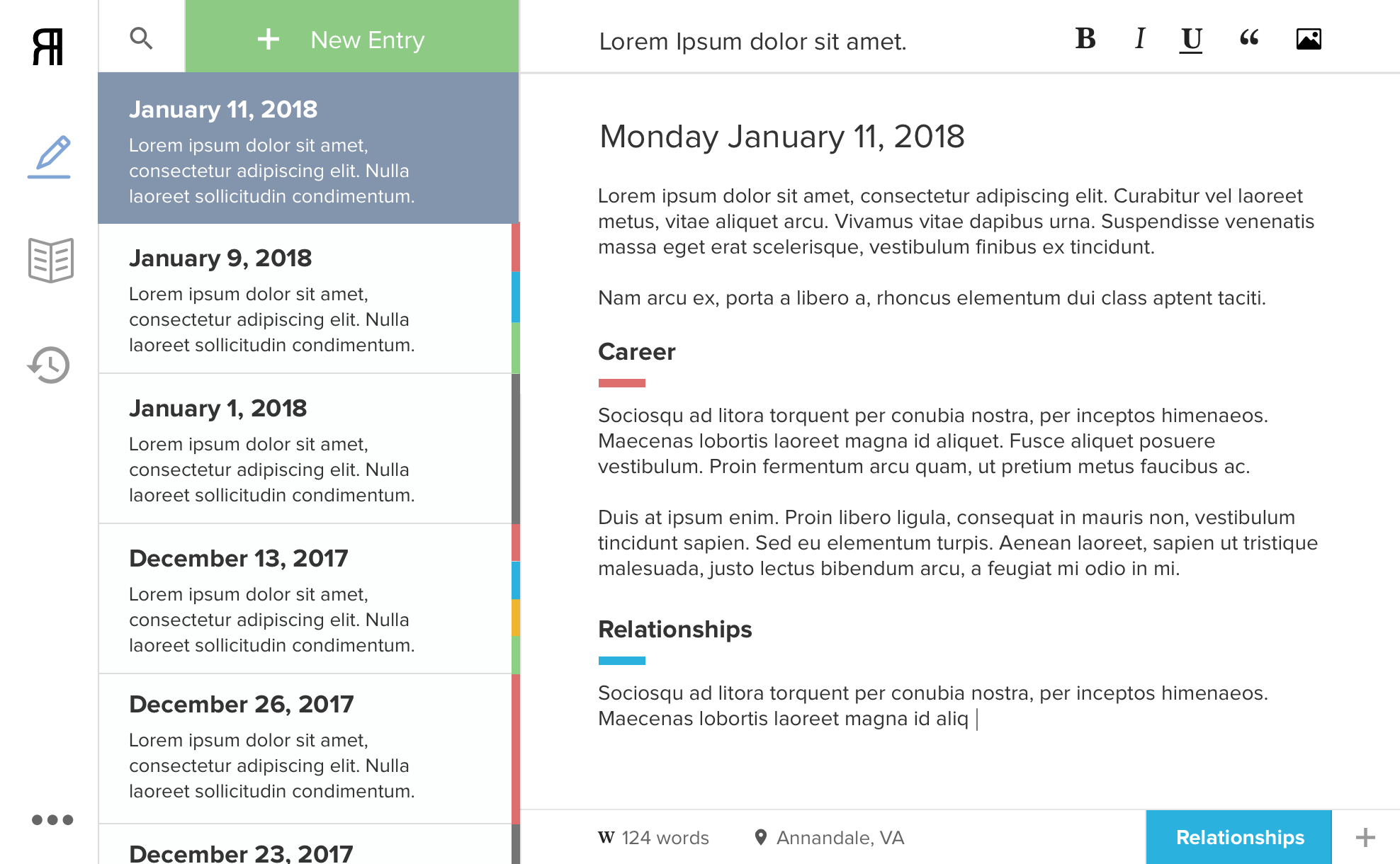
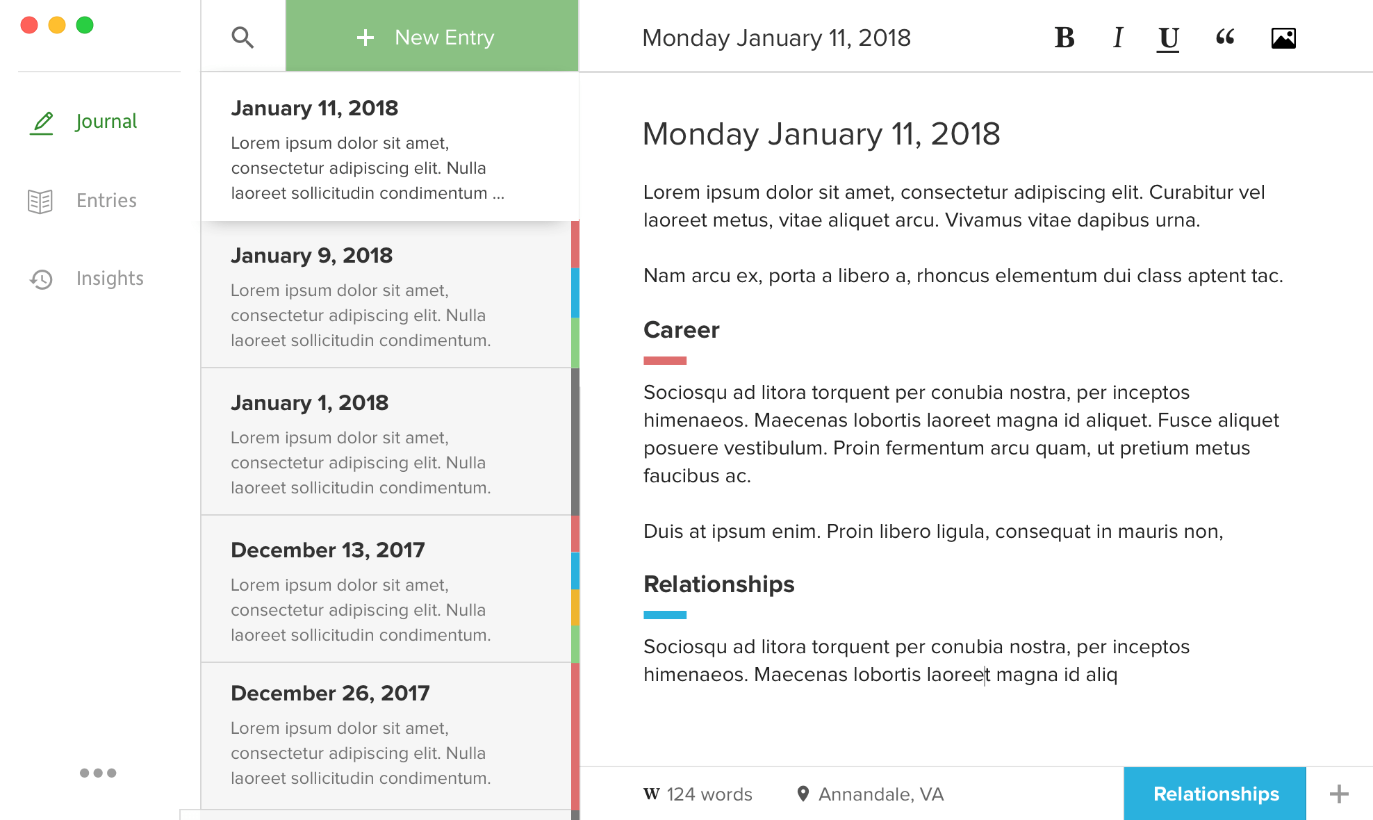
The main screen is the journaling page where the user can create new entries.
You can see the color coded topic tags on the sides of past entries which gives the user an idea of what their entries have been about in the past.
In the bottom right, there is the currently selected topic and the option to add more topics to its right.
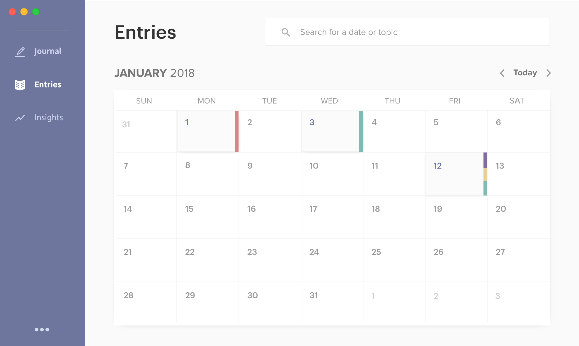
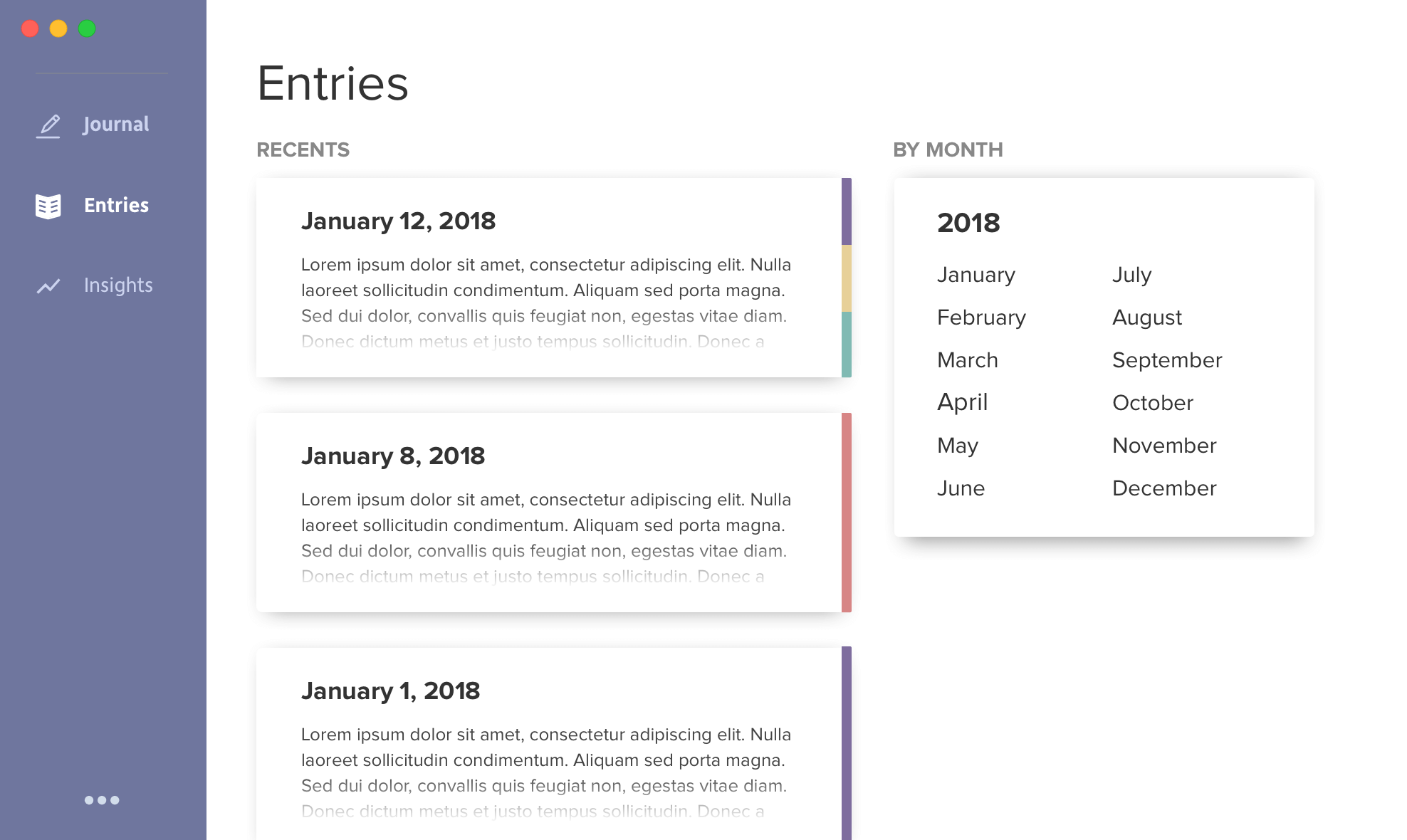
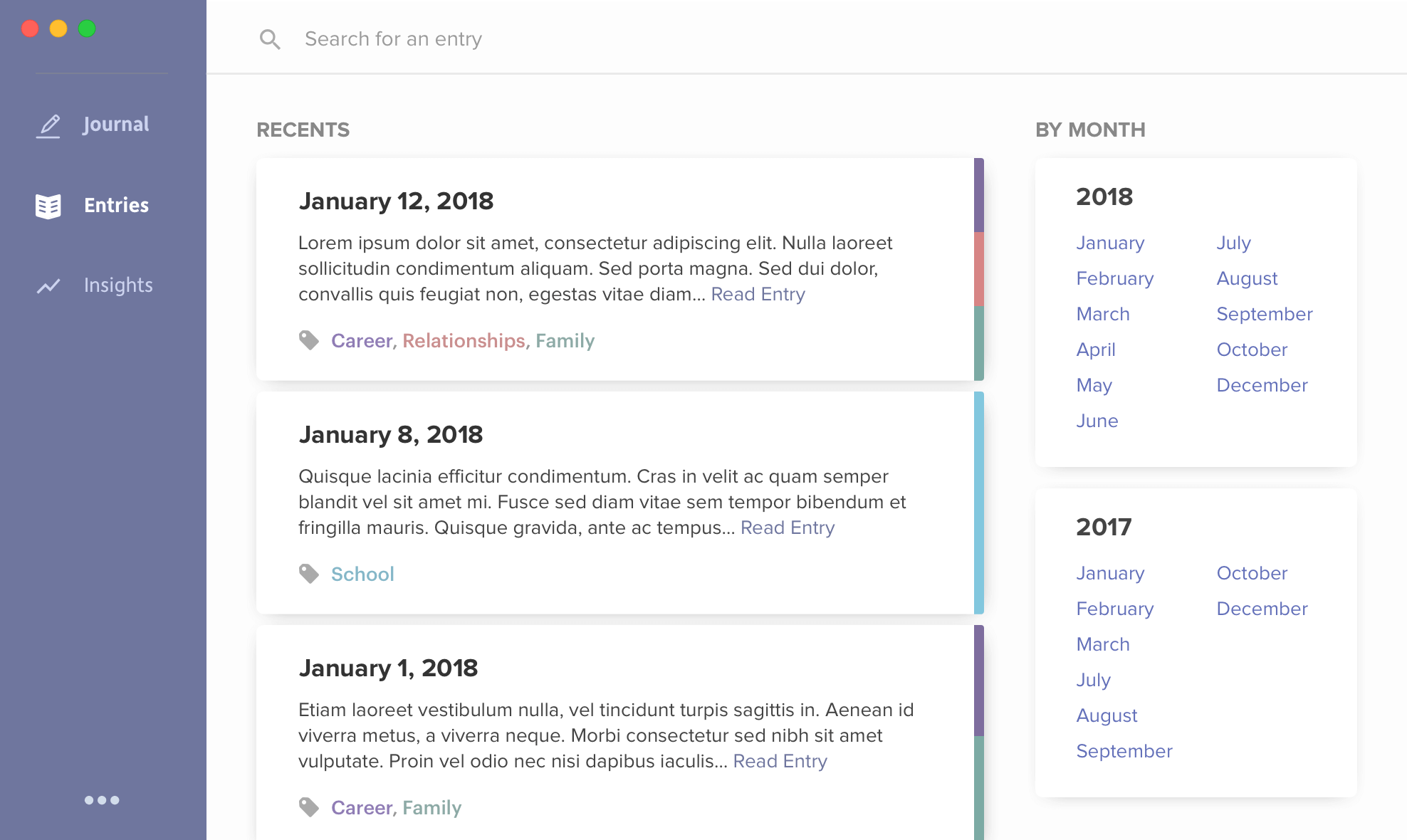
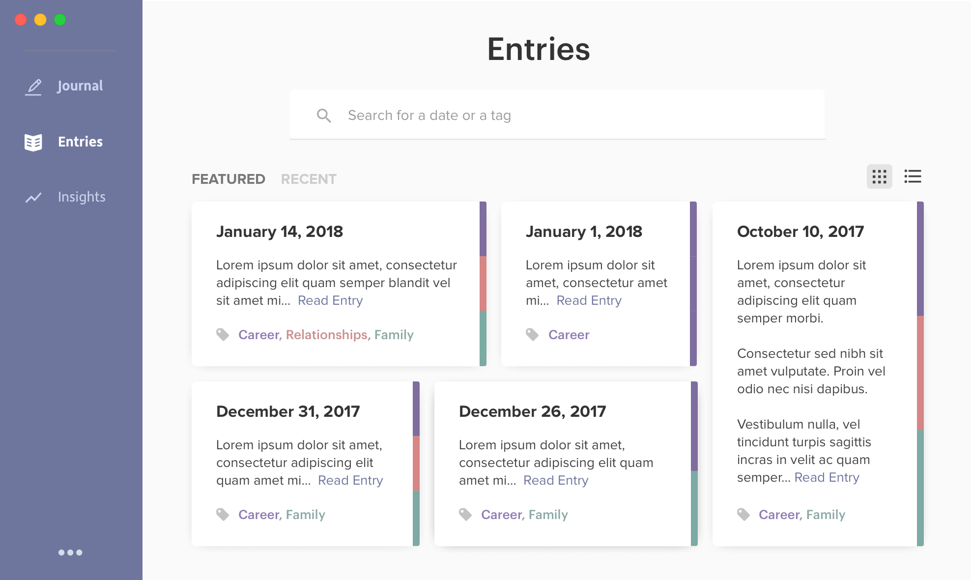
The entries page is a pretty simple calendar with a search function. Each entry on the calendar has the same side colors which show the user what topics are tagged in that entry.
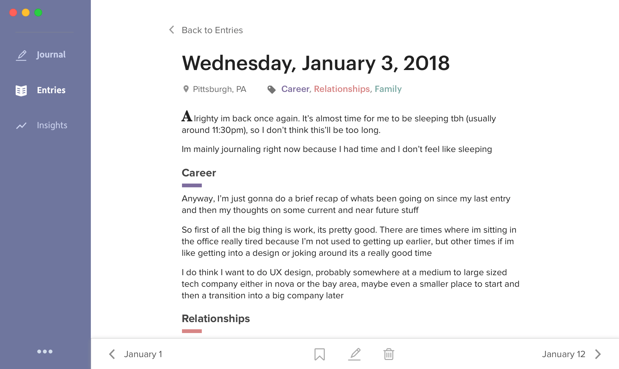
When viewing an individual entry, I wanted the user to feel like they were reading their own writing as a sort of article. So I had the large first letter and the secondary info below the title (location, tags) placed in a way that made it look like an article.
At the bottom, the user has the option to bookmark the entry, edit it, or delete it.
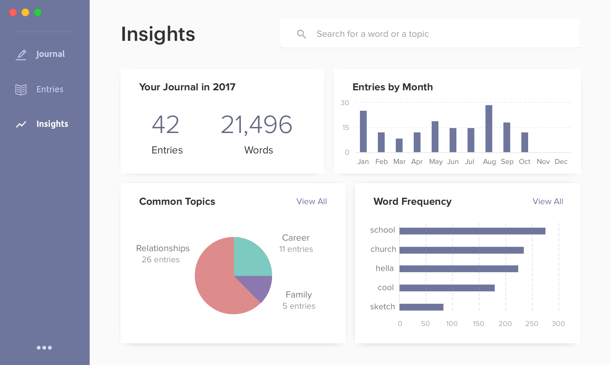
On the insights page, the user has access to different data on his/her journal.
First, they have general stats on their journal (total entries + words). Then they have a quick visualization on how much they journal. And then they have stats on the topics and words that they commonly use in their entries. Either of these can be further inspected by hititng "View All" in the respective card.
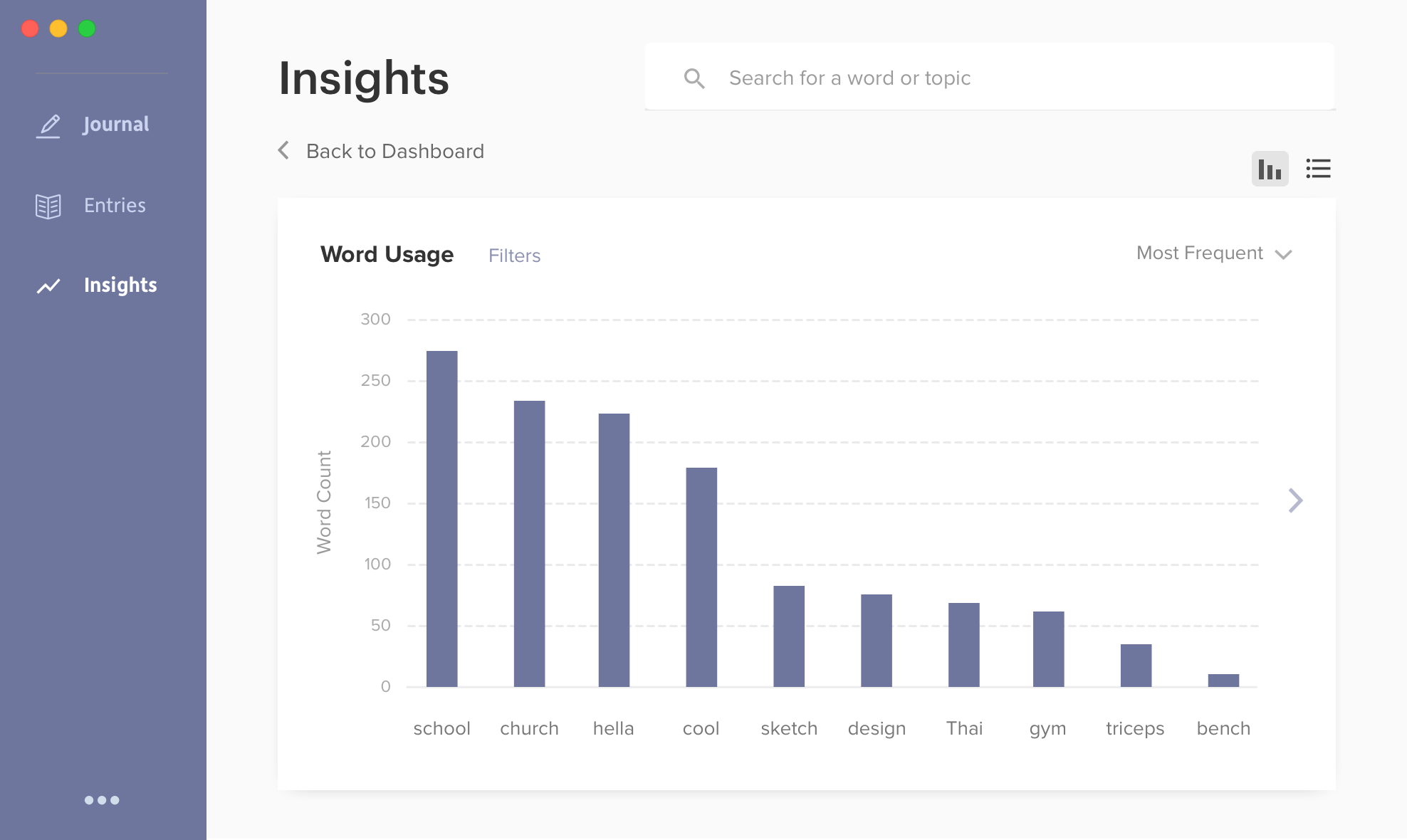
A full report has a larger chart and more options around the subject of the chart. Here, you can see the most frequently used words in the journal. You also have the option to see the least frequent words, the most common proper names used, the most common 3+ syllable words used, and more in the dropdown from the top right. You can also use the search function to see how many times a word has been used as well as it's usage over time.
Finally, I did a few animations in Framer to better visualize some of the interactions I imagined for the application.
Switching between different tags within an entry
Selecting an entry to read
Dashboard initializing
I struggled a bit with my initial designs for the journaling page because the interface felt empty and too spacious. I felt the need to add color in order to establish some visual balance and framing for the page. I later changed the sidebar to be a solid color in order to achieve this.
For the entries page, I initially drew straight from my wireframe. But in later iterations I started moving towards an idea I had in one of my initial sketches where the entries page looked like a home page for a news site with articles which tied in to the article theme of rereading entries.
Although I really liked the way my third iteration looked, I figured that a calendar would make the most sense and be the easiest to browse.
Next, I want to look into different data visualizations that can provide insights to users of the application. I think that "Topics Written About Over Time" or something with the number of words for different topics would be interesting to explore.